Andrea
Fratto
Resume


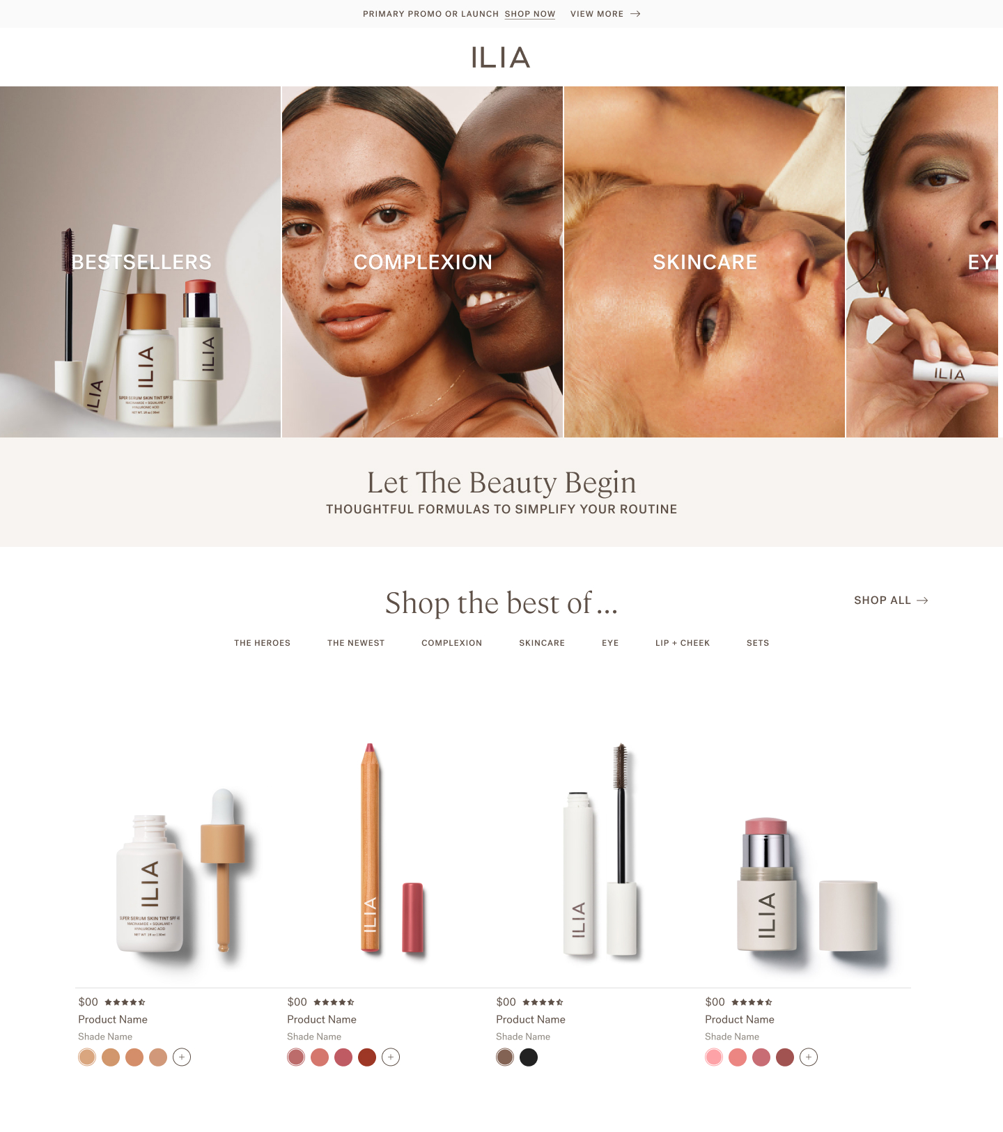
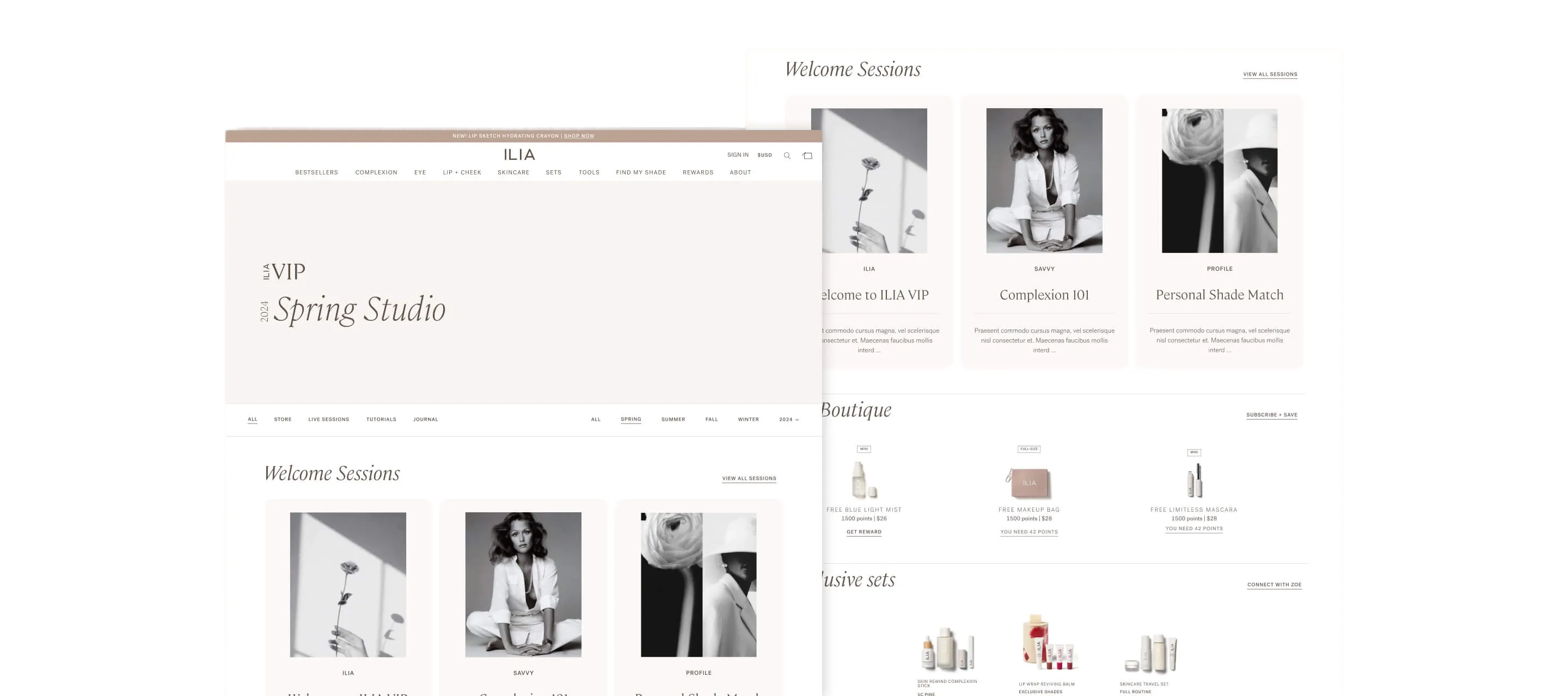
ILIA Beauty
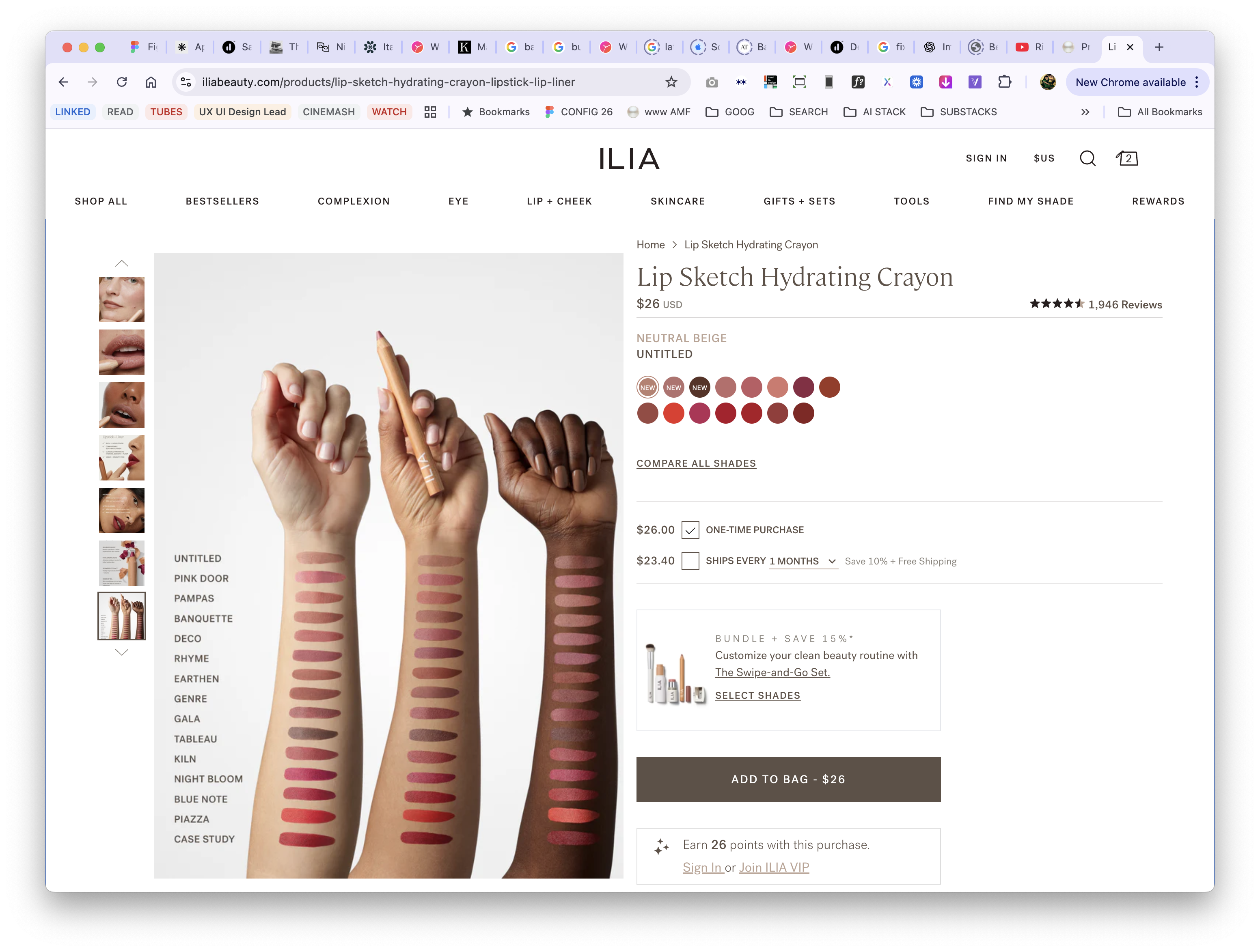
Compare Shades
Mobile-first shade comparison eliminating beauty e-commerce's biggest conversion barrier
Role
UX Strategy + Design Lead
Timeline
2022 • 2 months
Platform
Shopify Plus
Impact
32% increase in AOV ($79 → $104)
Eliminated friction in the purchase flow
Abstract Experience
Immersive Experience
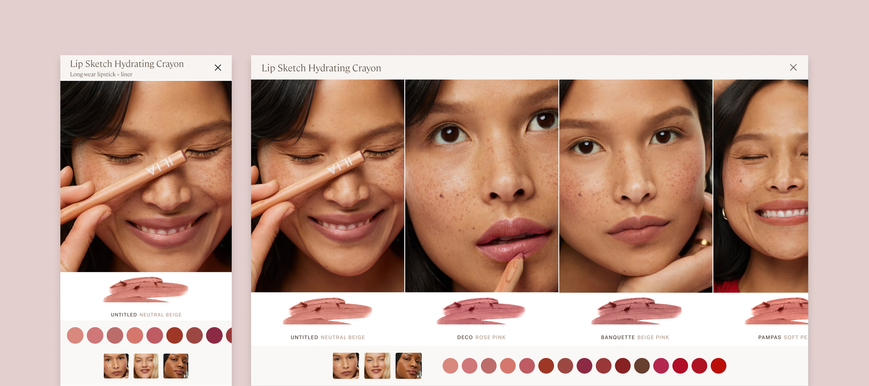
Shades diagramed in the abstract are as good as a guess.
Context
The Challenge
Choosing the right shade online is beauty e-commerce's biggest conversion barrier. ILIA's mobile shoppers (70% of traffic) faced a particularly frustrating experience: they had to tap individual shade swatches, wait for the page to reload, view the model, then repeat for every shade they wanted to compare. With 8-15 shades per product, this meant potentially 15+ page loads just to see which shade looked best. The friction was killing conversion. Online shoppers claimed virtual try-on feels “glitchy” and only works one shade at a time—”it’s fun, but not accurate.”
The cost of this friction: Shoppers uncertain about their shade match either didn't purchase, or purchased one shade when they might have bought multiple if comparison was easier. Average order value remained lower than it could be.
Business
Increase AOV, reduce shade-related returns, improve mobile conversion, differentiate from competitors
Shoppers
Compare shades quickly, see accurate color, visualize on real skin, feel confident in purchase
Design Challenge
Solve for mobile's 70% traffic majority while creating competitive differentiation
The Impact
Conversion & Revenue
- Average order value increased from ~$79 to ~$104 (32% lift)
- Shoppers purchased multiple shades after easily comparing (reduced guesswork)
- Mobile conversion rate improved as friction points eliminated
- Compare Shades became most-used feature on color product PDPs
Shopper Experience
- Shoppers could confidently compare 8-15 shades in under 30 seconds (vs minutes of page reloading)
- Natural swipe interaction required zero learning curve
- Strategic shade ordering meant likely comparisons were adjacent (plums next to berries, not random)
- First beauty brand to show product smear + shade name + model in single unified view
Operational Efficiency
- Custom feature scales across all products and doesn’t require creative asset production—all assets are fed in from the PDP
- Template served lipsticks, glosses, brow pencils, eyeshadows, blushes without redesign
- Reduced shade-selection friction and hesitation
- Created competitive differentiation (other brands still using clunky multi-click comparison)
11%
CR Up from a steady 5%
$104
+32% AOV increase. $79 → $104

Eliminated friction in mobile
purchase flow
My Role + Team
My Role
As UX Strategy + Design Lead, I owned the feature from research through implementation:
- Conducted competitive analysis across premium beauty brands identifying gaps in shade comparison experiences
- Designed mobile-first immersive slider optimized for swipe interaction
- Collaborated with Product Education team on strategic shade ordering logic
- Created information architecture showing product smear, shade name, and model in unified view
- Partnered with Creative on photography standards ensuring consistent lighting for accurate comparison
- Designed to scale across all products and doesn’t require creative asset production—all assets are fed in from the PDP
- Led development partnership defining gesture controls and performance optimization
Constraint: Design for mobile's 70% traffic majority first, then adapt for desktop without losing mobile optimization.
Key Partners
Product Education Confirmed strategic palette ordering ensuring likely comparisons were adjacent: Plums + berries, neutrals + earthy, reds + bolds
Editorial Created shade descriptions helping shoppers navigate shade progressions
Creative Established photography standards for consistent lighting and accurate color representation
Research Insights
No competitive beauty brands were solving shade comparison well on mobile; All had multiple taps + reloads
None showed critical trifecta in single view: product smear (true color) + shade name (reference) + model (real-world application)
Virtual try-on feels “glitchy” Online shoppers claimed it only works one shade at a time—”it’s fun, but not accurate.”
Shoppers who felt confident in shade selection purchased multiple shades (backup shade, complementary tones)
3 Key Design Decisions
Key Design Decisions
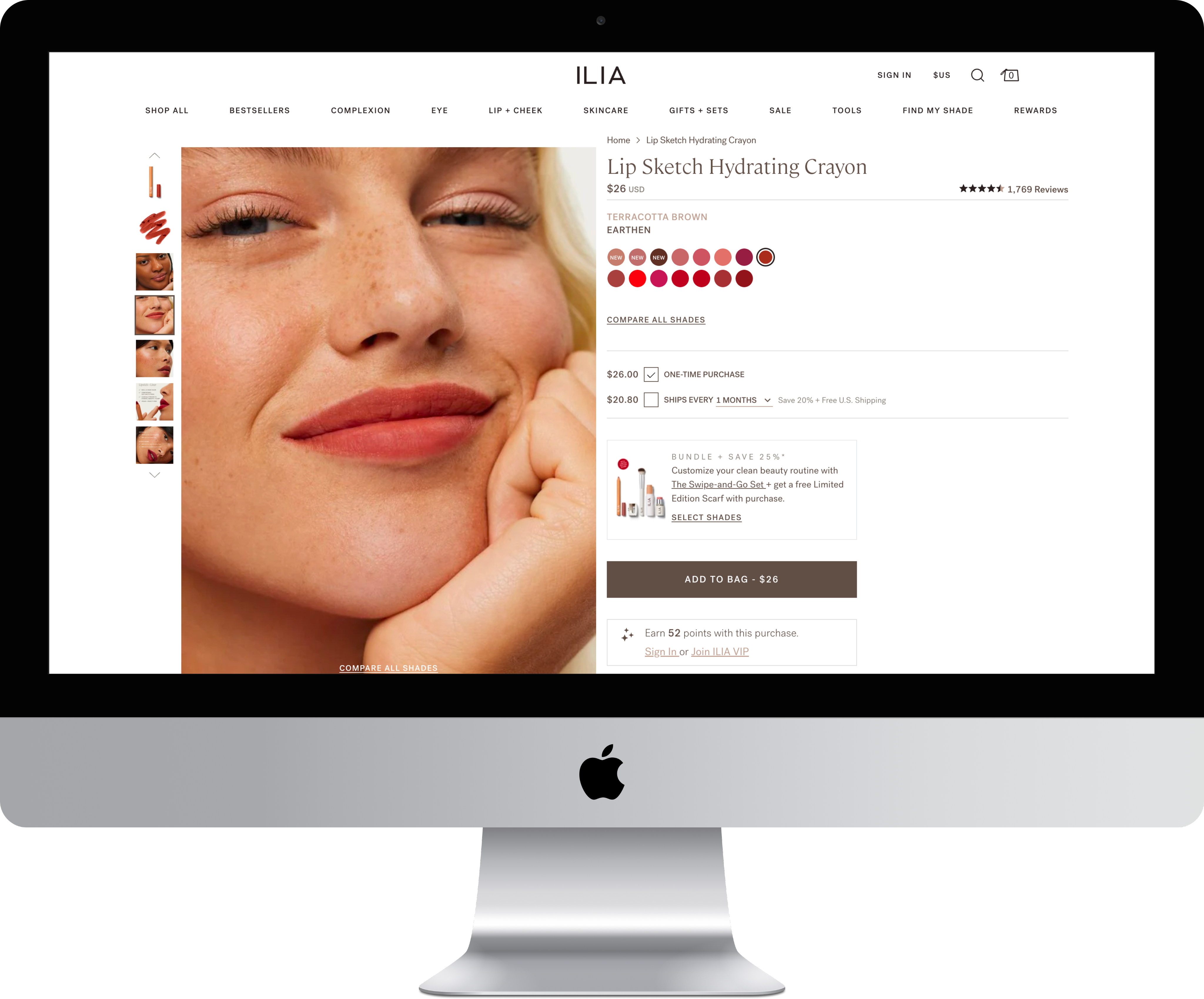
#1 Mobile-First Immersive Slider
The Challenge
ILIA's existing shade selection required discrete interactions: tap swatch, wait for page reload, view model, repeat. For mobile shoppers (70% of traffic), this pattern created friction at the worst possible moment—the purchase decision. With 8-15 shades per product, shoppers faced 15+ page loads to compare options thoroughly. The cognitive and time burden led to cart abandonment or single-shade purchases when customers might have bought multiple shades if comparison was effortless.
Research insight: Competitive analysis across premium beauty brands revealed everyone struggling with mobile shade comparison. Most used modal overlays or page reloads. None leveraged mobile's native swipe gesture for continuous browsing. The opportunity was clear: own the best mobile shade comparison experience in beauty ecommerce.
The Solution
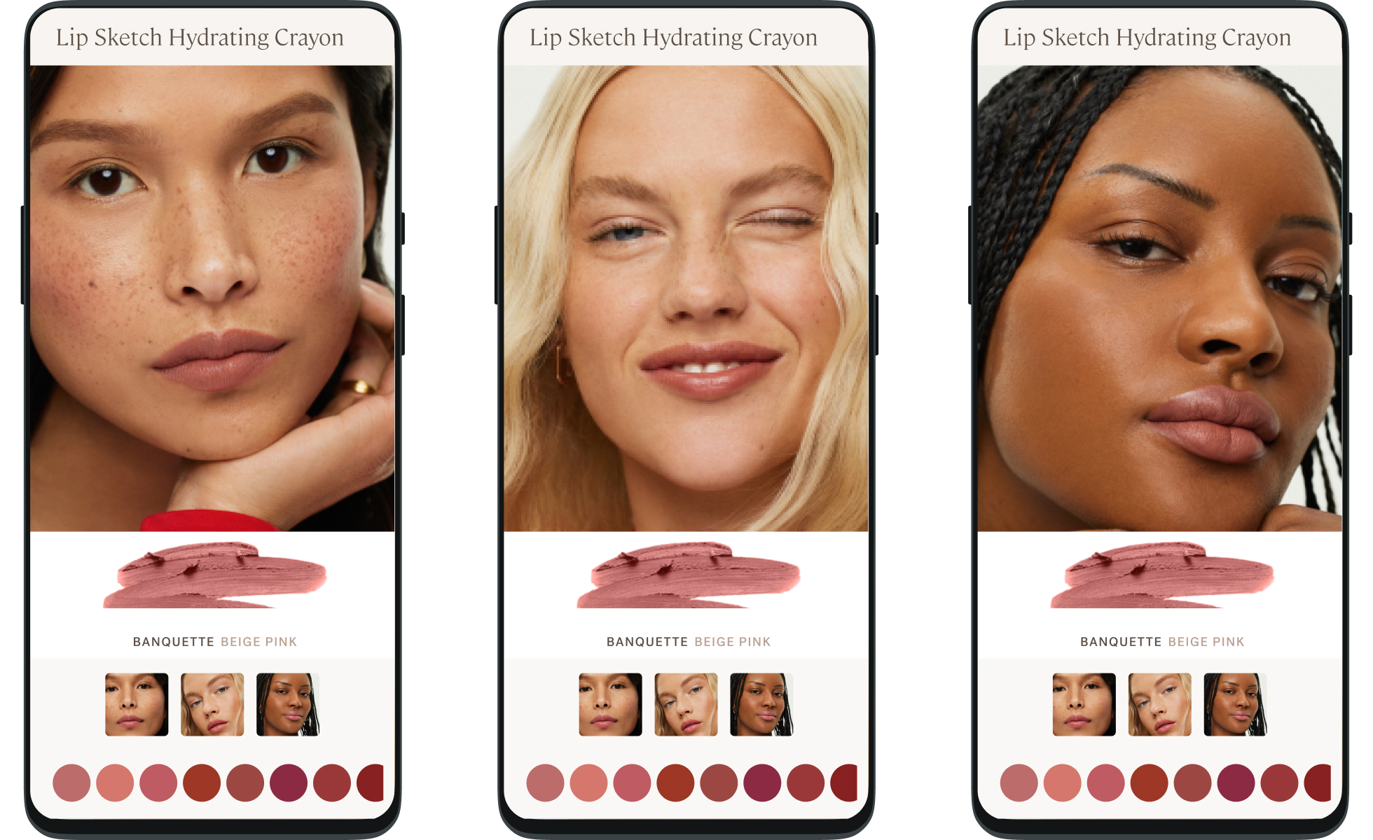
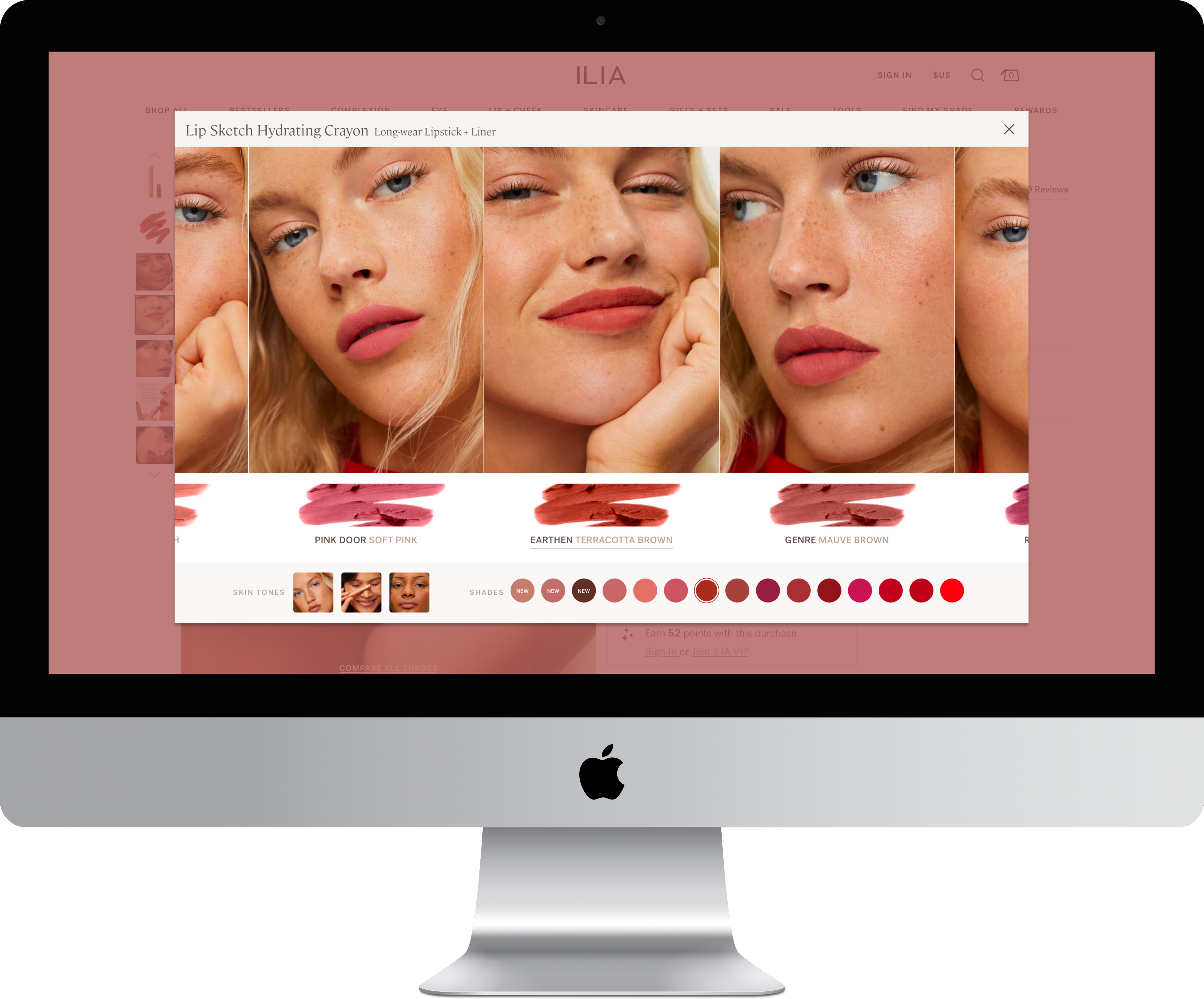
Designed mobile-first immersive slider with native swipe interaction; Desktop is the same experience with a larger viewport:
- Designed for 70% mobile traffic first, then adapted for desktop
- Large touch targets throughout (thumb-friendly on smallest screens)
- One smooth interaction replacing 15+ discrete page loads
- Horizontal swipe for continuous shade browsing
- Large, zoomed images mimics pinch+zoom behavior
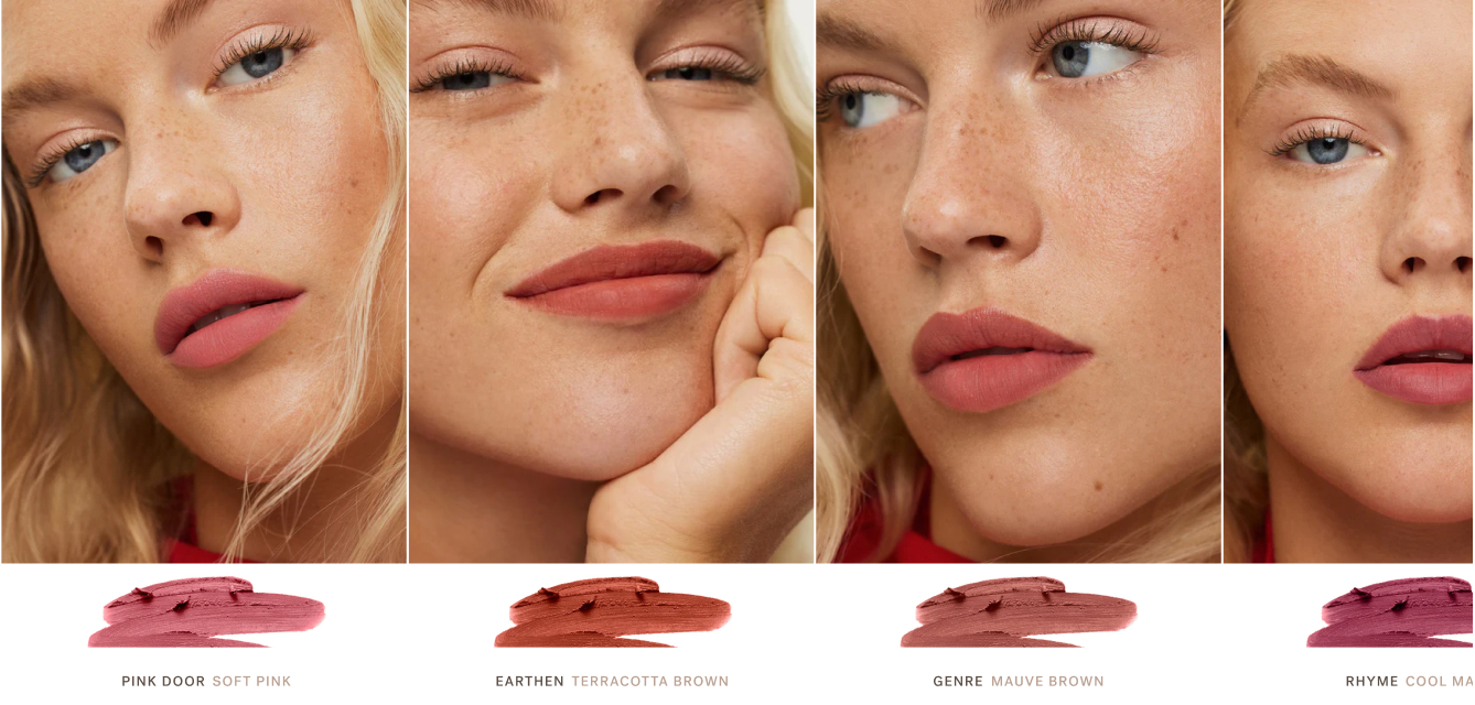
- Each panel shows large model image, product smear swatch, shade name, undertone descriptor
Design principle: Shop like you do in-store. Recreate the physical experience of lining up testers side-by-side and comparing them.
The Impact
+11%
Conversion lift
Conversion rate improved through friction elimination

High Engagement
Intuitive feature became most-engaged element on color PDPs
intuitive ease
Shoppers compared 8-15 shades in under 30 seconds (previously took minutes with page reloads)

Much Loved Feature
“Oh, I love this.” The surprise of it being so intuitive and easy
Key Design Decisions
#2 Strategic Shade Ordering for Intuitive Discovery
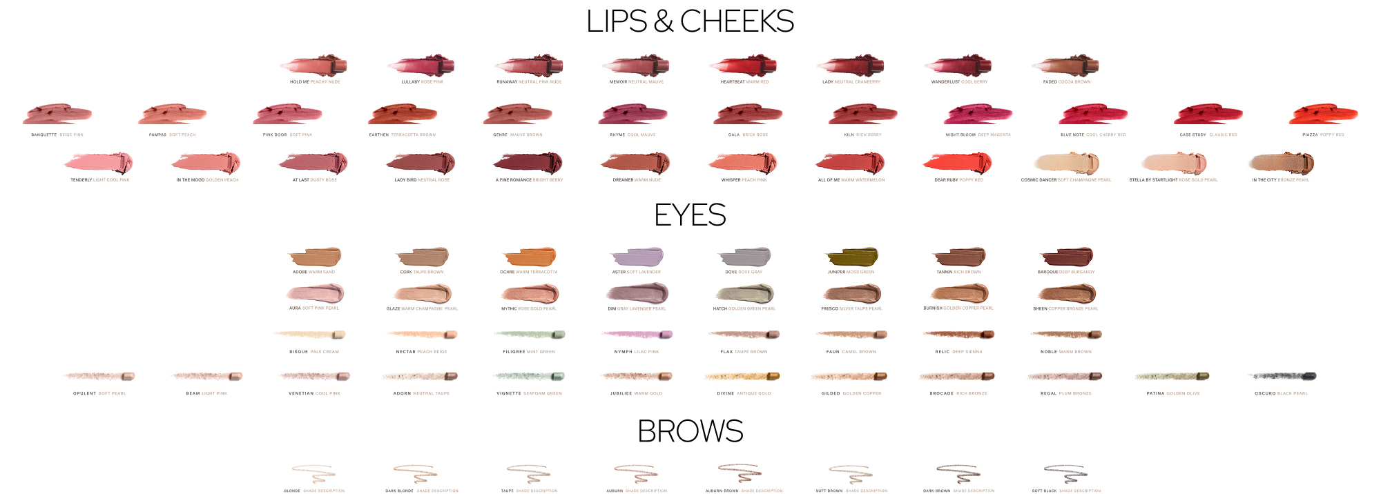
Shade Palette Order
Strategic shade ordering and undertone progression
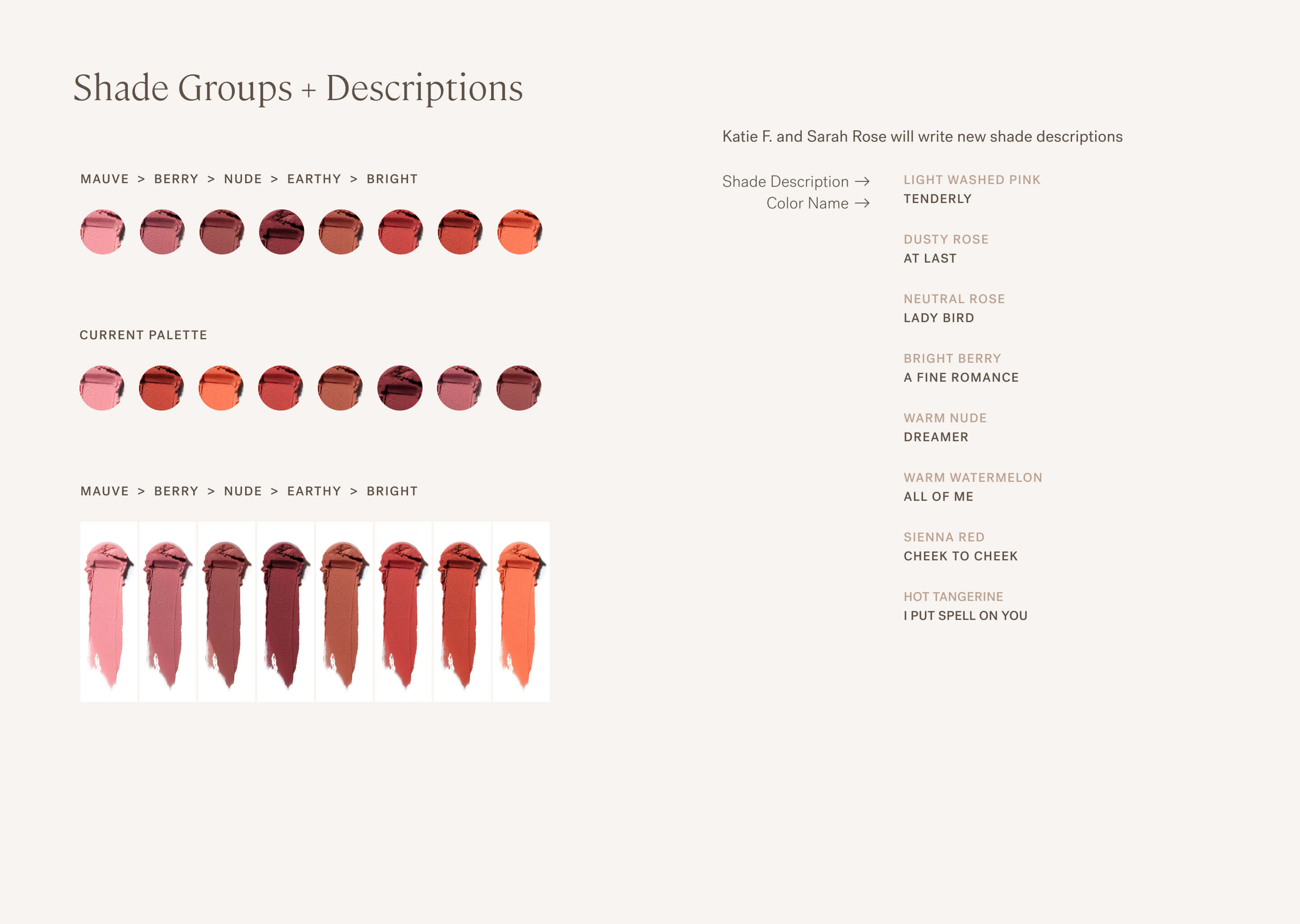
Standard across all color products
The Challenge
Even with effortless swiping, shade comparison fails if shoppers can't find logical progressions. If plum shades are scattered randomly across the palette, shoppers must hunt for complementary tones. If light-to-dark progression doesn't follow intuitive patterns, comparison becomes cognitive work. The old PDP organized shades arbitrarily—often by SKU or sales rank—forcing shoppers to mentally reorganize what they were seeing.
Research insight: In-store, shoppers compare adjacent testers assuming logical grouping. Online, without physical context, strategic ordering becomes critical.
The Solution
Collaborated with Product Education team to establish strategic shade ordering logic ensuring likely comparisons were adjacent.
- Pinks + Corals: Soft pinks, peachy corals, warm pinks
- Plums + Berries: Mauves, plums, berry tones
- Neutrals + Earthy: Nudes, browns, terracotta
- Reds + Bolds: Classic reds, brick reds, bold corals
- Light to dark shades; Cool to warm undertone shifts
Design principle: Reduce cognitive burden by organizing shades the way customers think about color. If a shopper is viewing a plum lipstick, the next shade should be a related berry tone, not a random orange.
The Impact

Proven Hypothesis
Shoppers discovered complementary shades through natural browsing

Basket Builder
Increased multi-shade purchases: multiples or complementary shades

Standard Palette Order
Strategic ordering became reusable standard across all color product PDPs

Brand Impression
Created competitive differentiation through thoughtful curation vs arbitrary display
Key Design Decisions
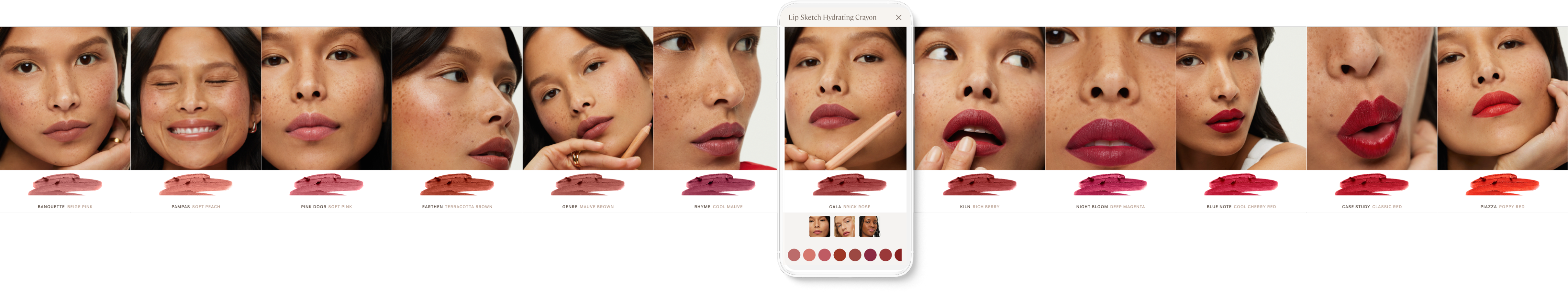
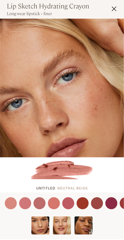
#3 Complete Information in Single View
Fractured Experience
No gestalt ... the onus is on the shopper to put it all together.
Unified Experience
Information hierarchy, info and controls in a single view.
The Challenge
Shade selection requires three critical pieces of information: true color (product smear), color name (for reference), and real-world application (how it looks on skin). Most beauty brands force shoppers to choose—see the swatch OR see the model, abstract view of shade names and color on wrist. This fragmented information creates uncertainty. Shoppers toggle between views, trying to hold multiple mental images while making comparisons.
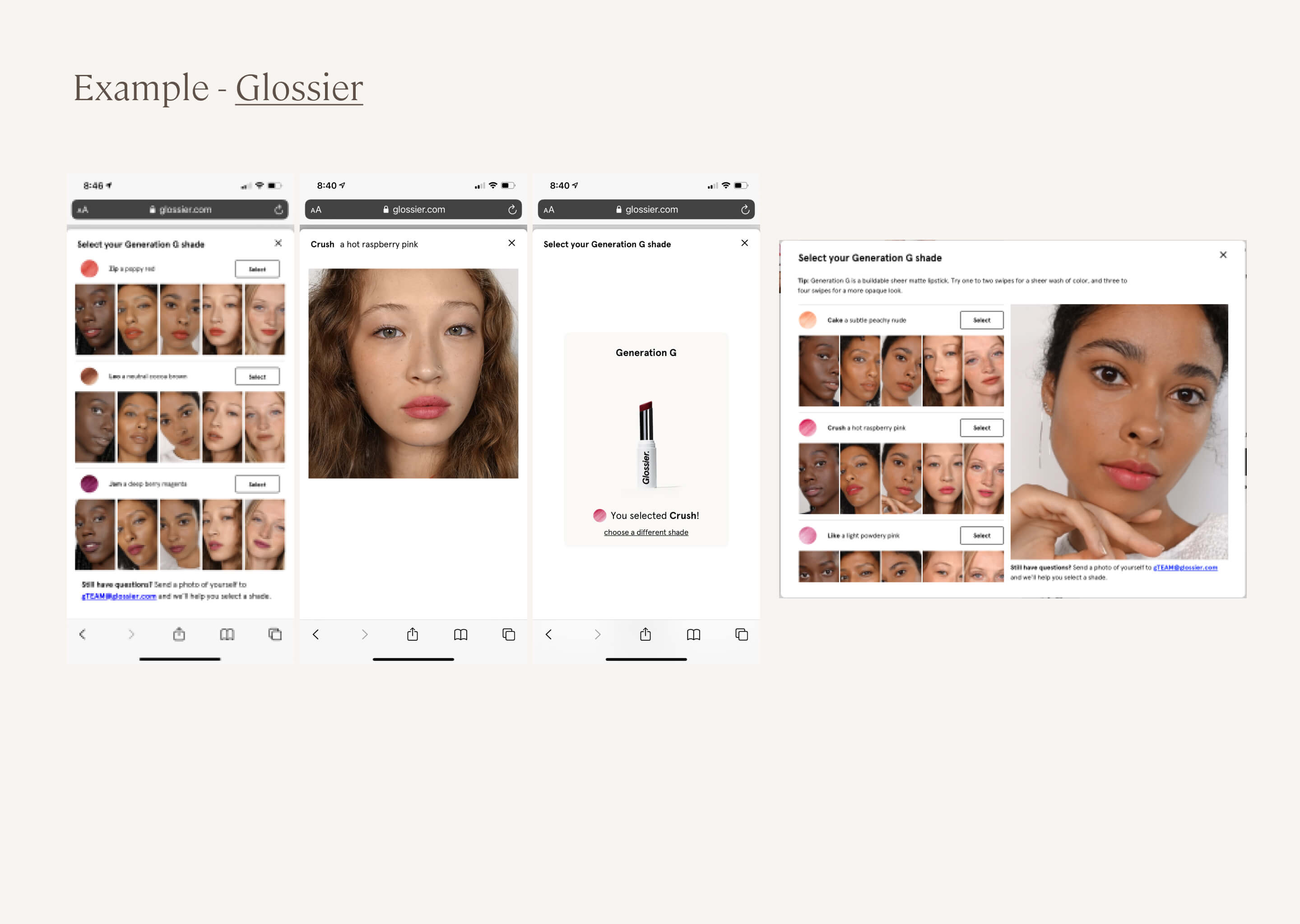
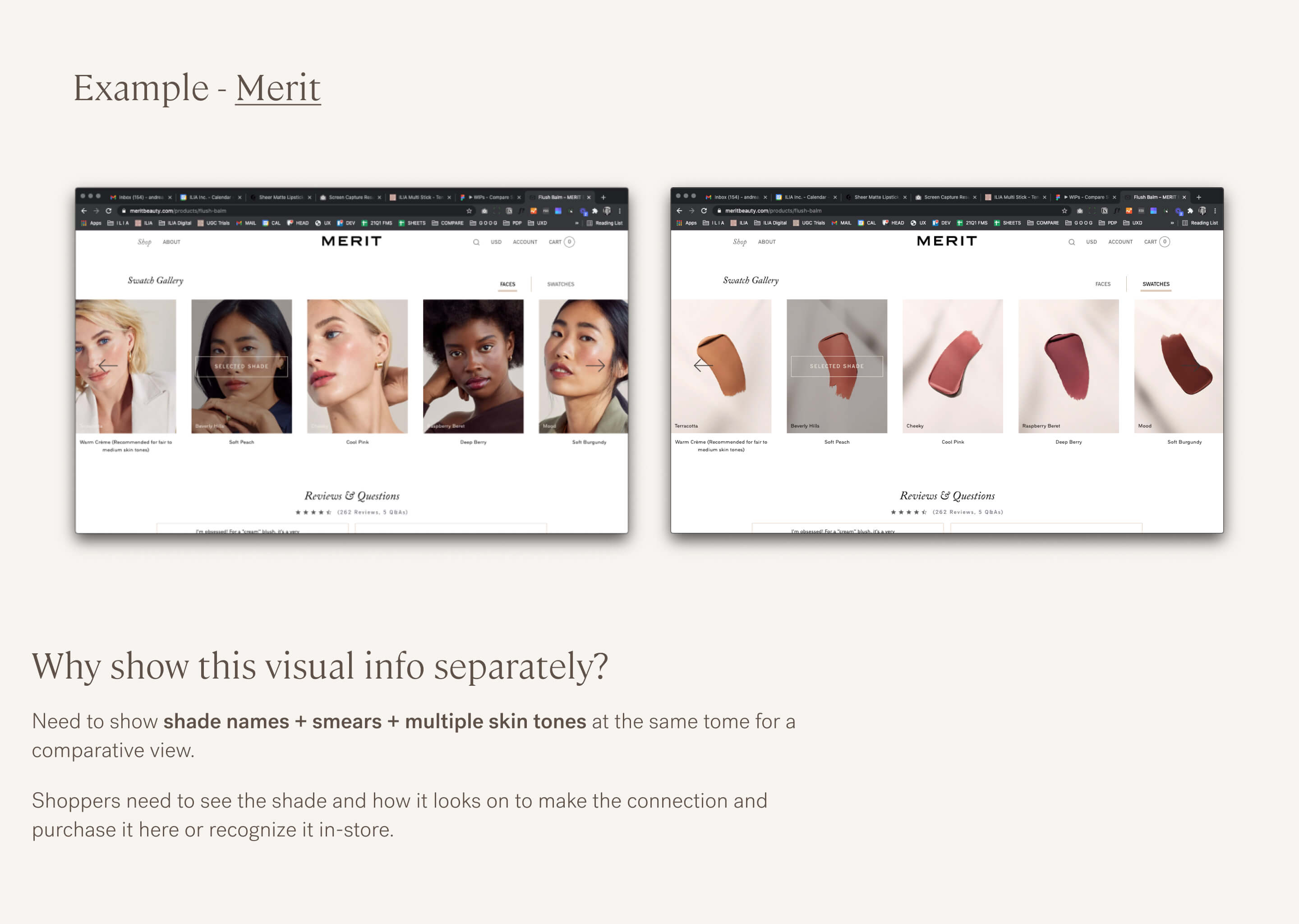
Research insight: No beauty brand was presenting all three as a single concept in a mobile-optimized format. Glossier + Merit had tiny images and fractured views. The gap was obvious: give shoppers everything they need in one unified view.
The Solution
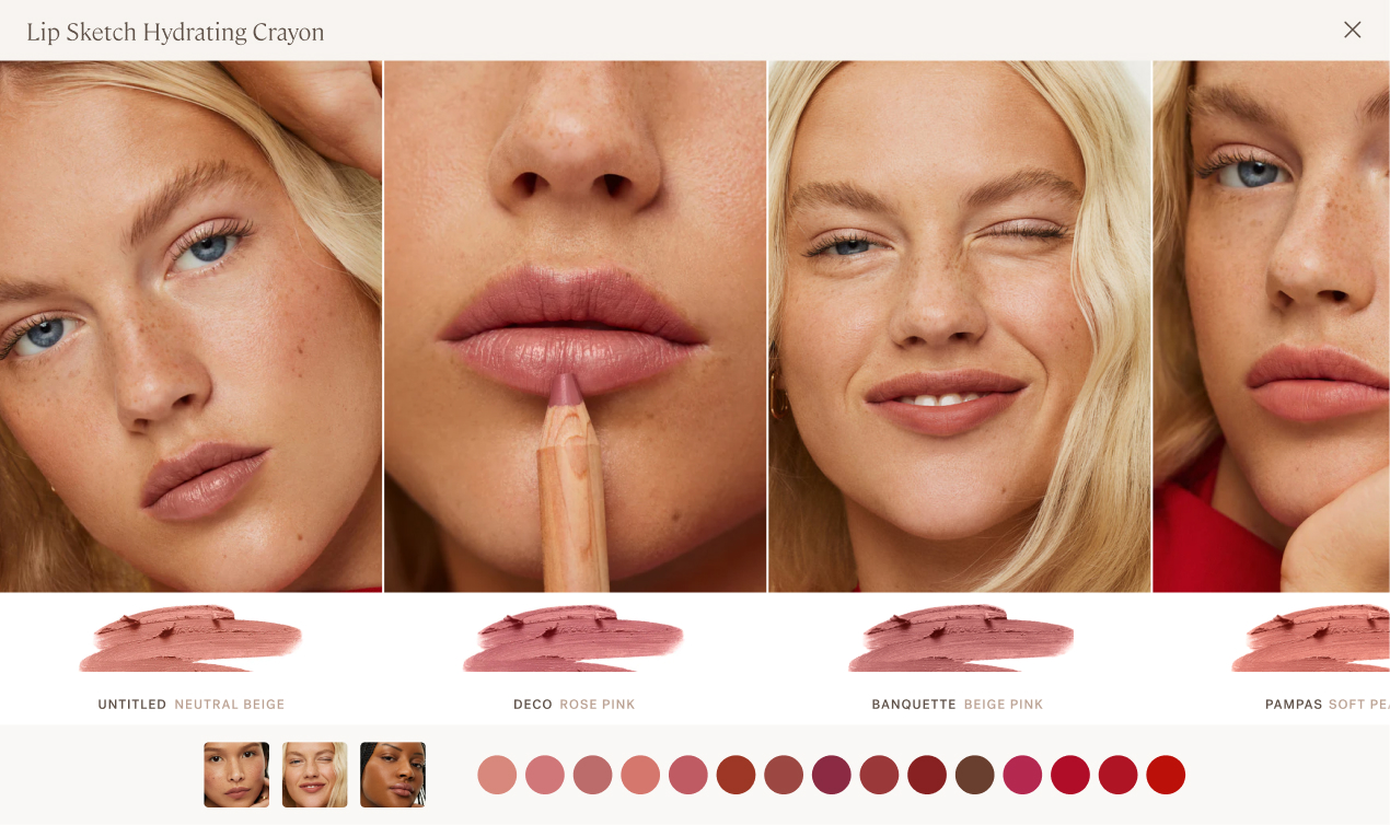
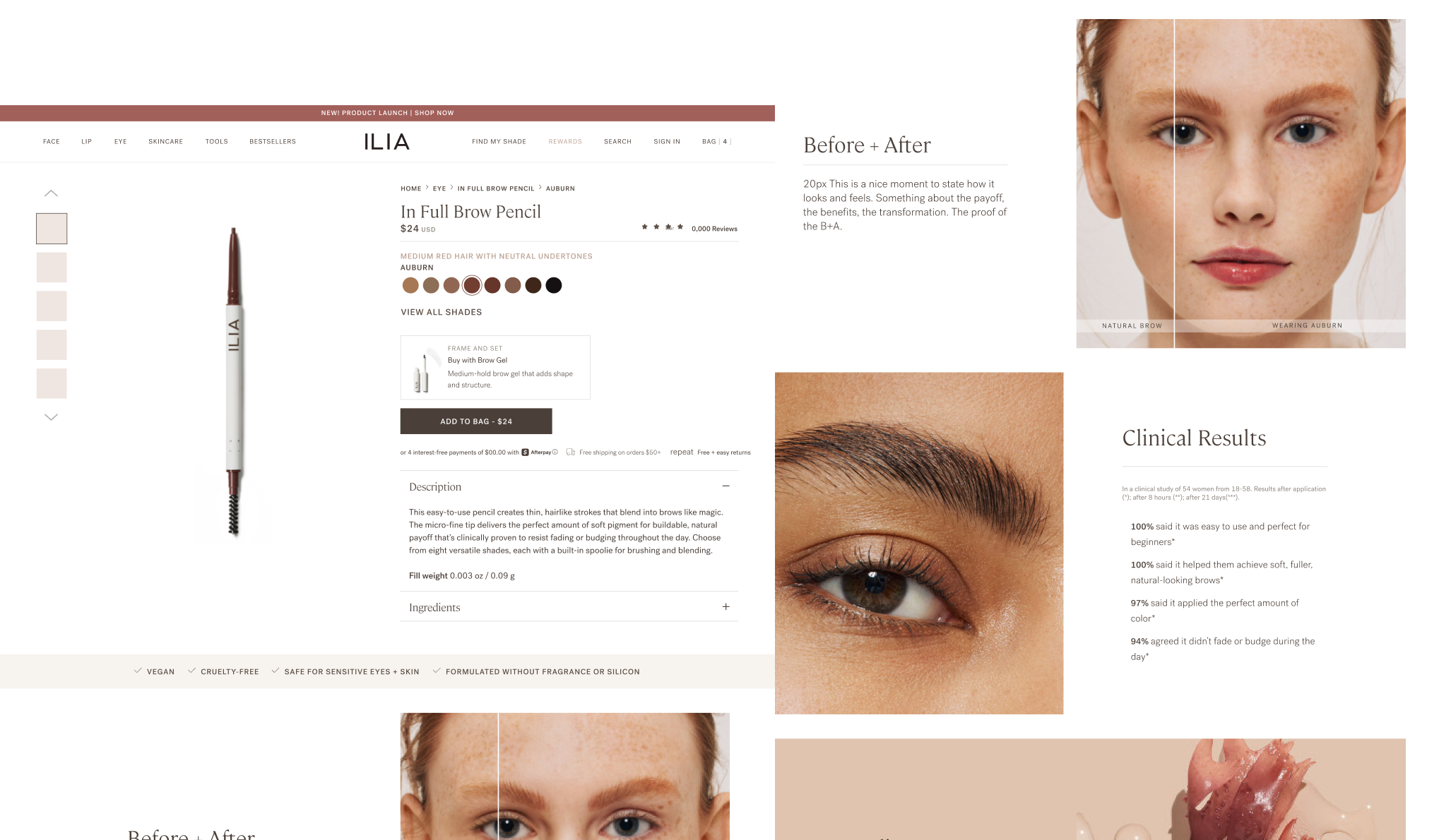
Designed information architecture showing product smear, shade name, and model imagery simultaneously in each panel:
Panel hierarchy:
- Large (zoomed-in) model image: Mimics common pinch + zoom behavior
- Product smear: True color representation for accuracy
- Shade name + description: Reference information and dimension
Photography standards:
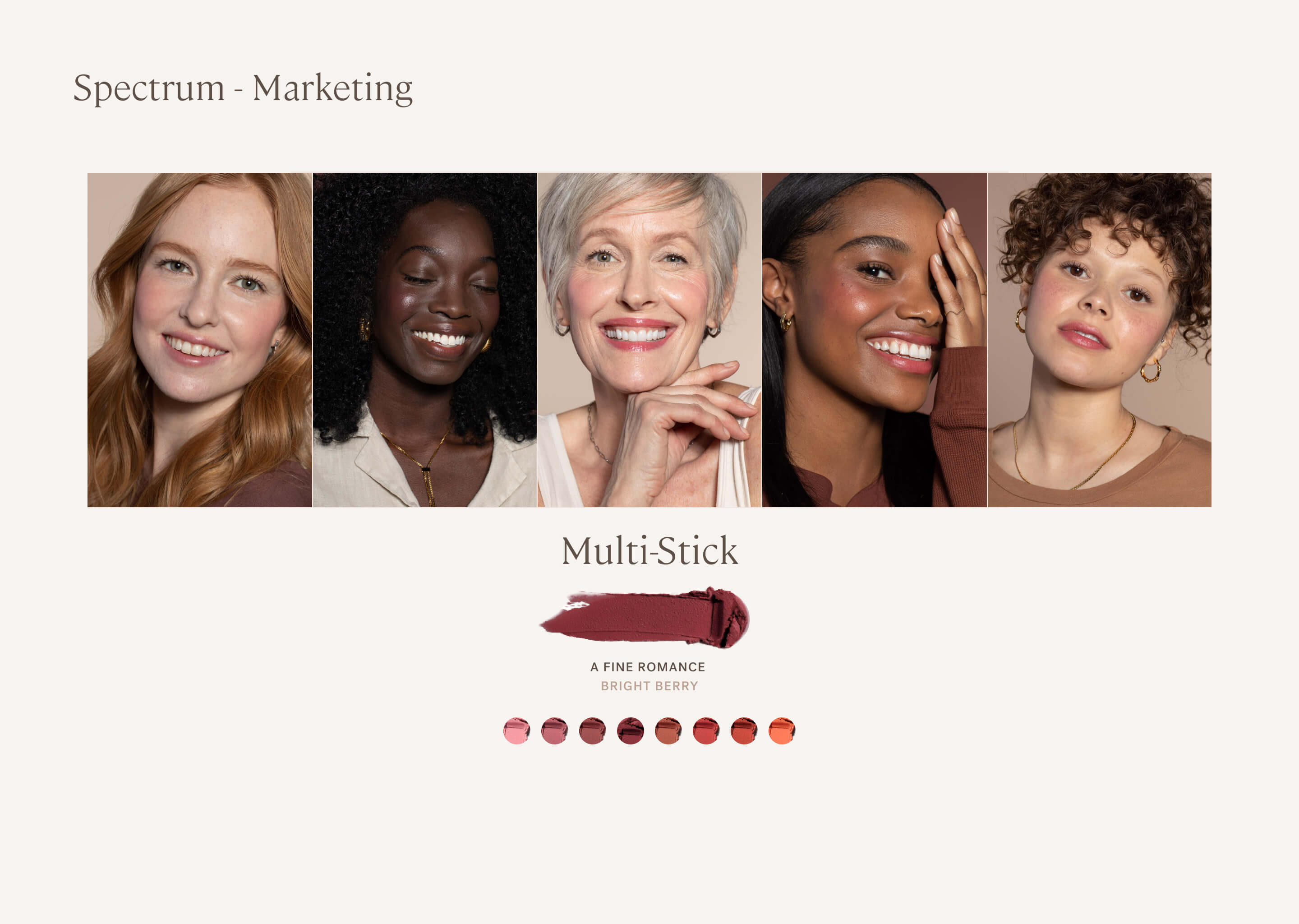
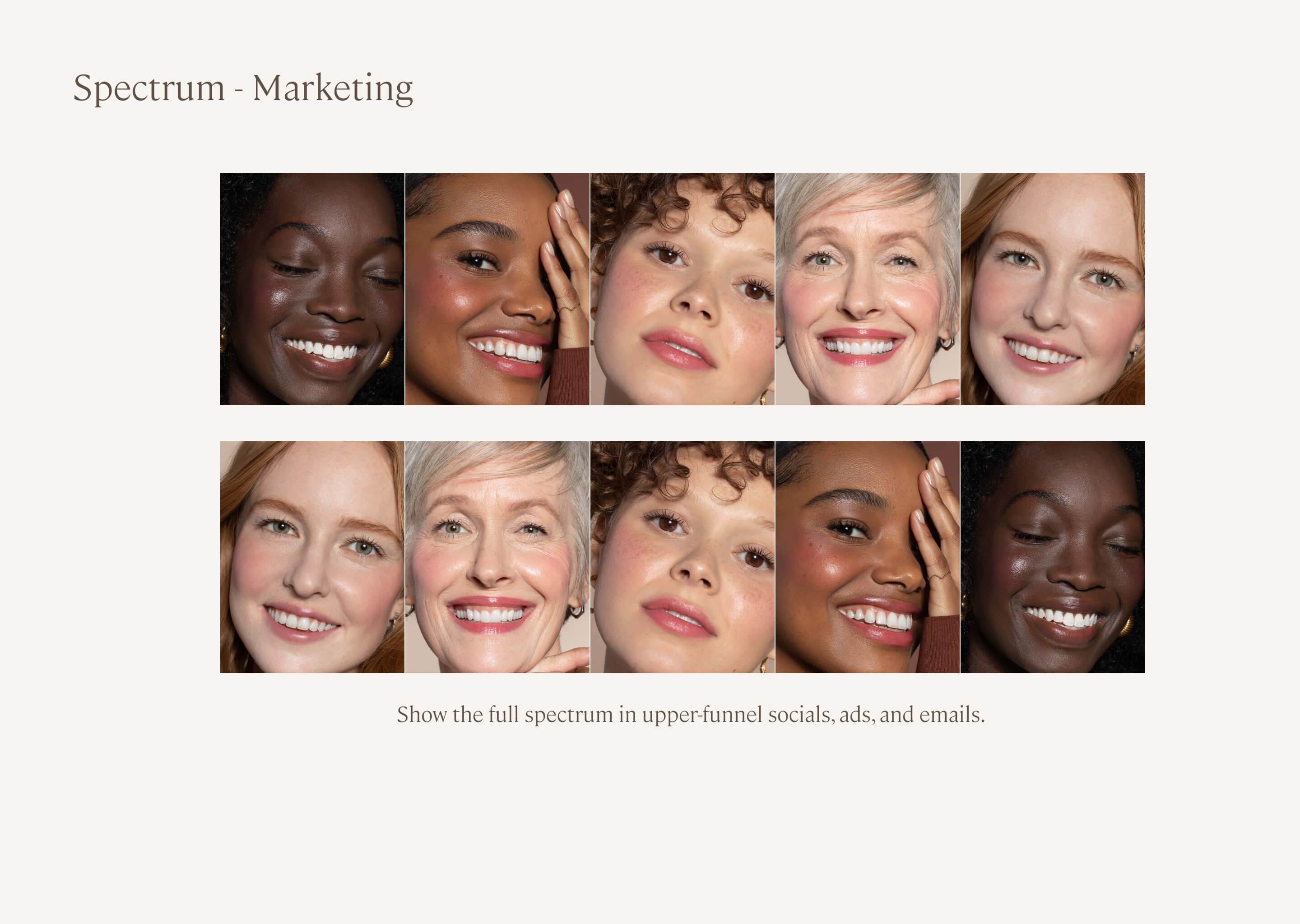
- Diverse representation showing shades on different skin tones
- Expressive, but aligned for product-focused comparison
- Product smear photographed under standardized lighting for color accuracy
Design principle: Everything you need, nothing you don't. Don't make shoppers toggle between views or remember information from previous screens. Show the complete concept in every panel.
The Impact

Comparative View
Shoppers made confident purchase decisions without toggling between views, or leaving the PDP

Standard feature
Photography and information standards became reusable across product lines

Gestalt View
Only beauty brand showing smear + name + model in unified mobile view

Differentiator
Created sustainable competitive advantage through superior information design
What I Learned
This project taught me that solving for mobile constraints first often creates better experiences across all platforms, not worse compromises.
Key Insights
What made it work: The combination of mobile-first design, strategic shade ordering, and comprehensive information in each panel. Shoppers didn't have to choose between seeing color accuracy OR seeing the shade on a model—they got both simultaneously. The swipe interaction felt effortless, turning shade comparison from a chore into an engaging experience.
Competitive advantage comes from solving problems others ignore: Every beauty brand struggles with mobile shade comparison. Most settle for "good enough" multi-click patterns. By deeply solving this specific problem—immersive swipe interaction, strategic ordering, complete information—we created defensible differentiation and meaningful business impact (32% AOV increase).
Roadmap
Future Iterations
A mix of custom design and leveraging UGC platforms
The Compare Shades foundation enables future personalization:
- Upload your own photo and see all shades on you
- AI-powered shade recommendations based on skin tone analysis
- "Shades similar to ones you've purchased" for returning customers
- Seasonal shade collections and limited edition discovery
- Integration with VIP program showing member-exclusive shades
Featured Projects
Ilia Beauty
Remove The Barrier
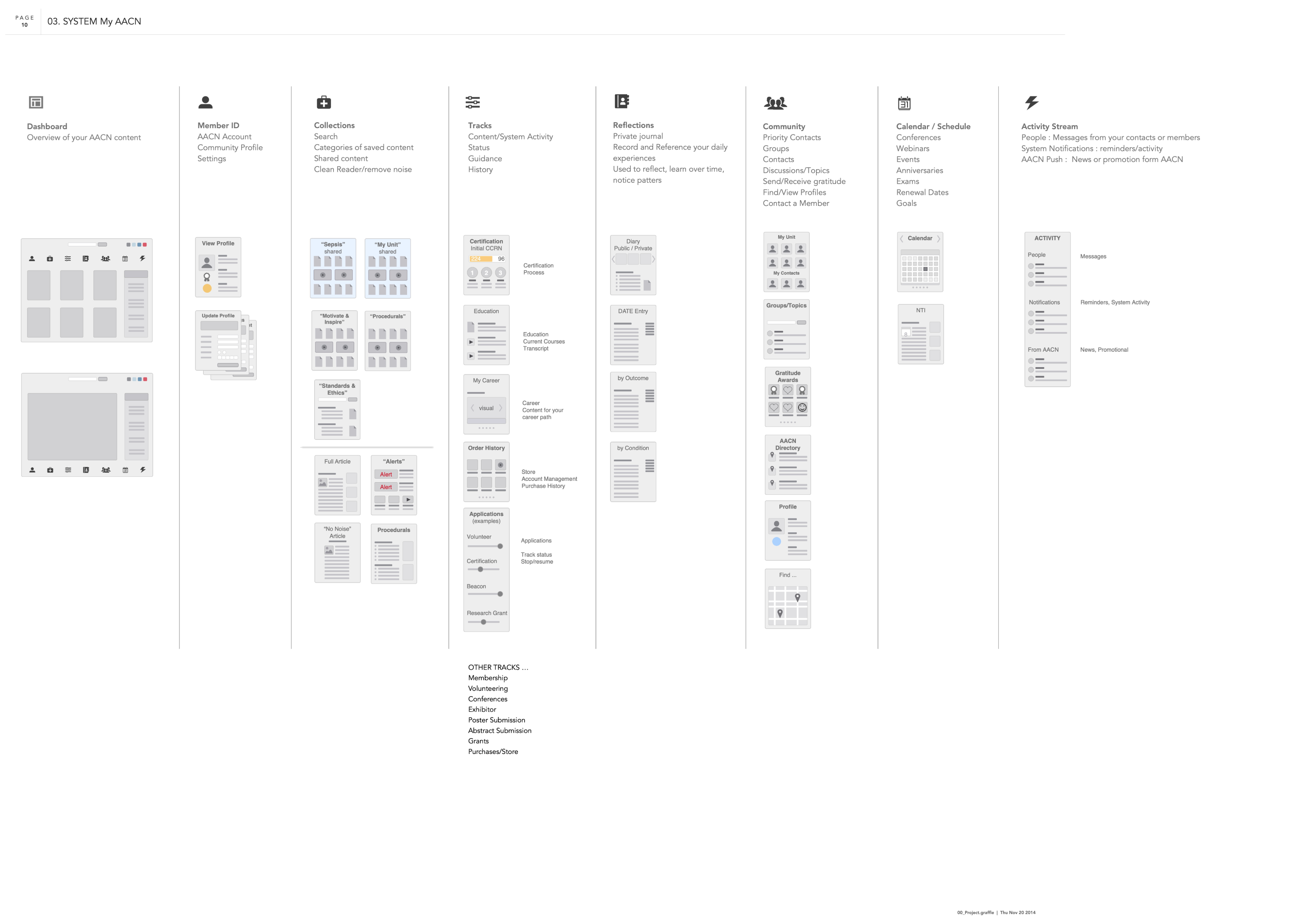
American Association of Cardiac-Care Nurses
The Whole Nurse Platform
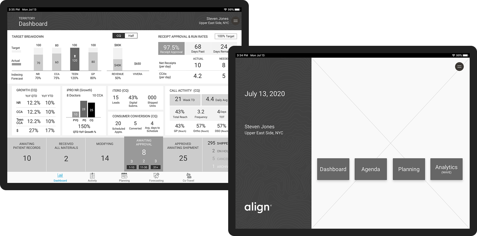
Align Technology
Unified Global CRM
Ilia Beauty
Show & Sell
Ilia Beauty
Demo vs. Details
Ilia Beauty
Let’s Get Personal
Coming
Soon
Andrea Fratto
Resume
ILIA Beauty
Compare Shades
Mobile-first shade comparison eliminating beauty e-commerce's biggest conversion barrier
Role
UX Strategy + Design Lead
Timeline
2022 • 2 months
Platform
Shopify Plus
Impact
32% increase in AOV ($79 → $104)
Eliminated friction in the purchase flow
Abstract Experience
Immersive Experience
Shades diagramed in the abstract are as good as a guess.
The Challenge
The Impact
Choosing the right shade online is beauty e-commerce's biggest conversion barrier. ILIA's mobile shoppers (70% of traffic) faced a particularly frustrating experience: they had to tap individual shade swatches, wait for the page to reload, view the model, then repeat for every shade they wanted to compare. With 8-15 shades per product, this meant potentially 15+ page loads just to see which shade looked best. The friction was killing conversion. Online shoppers claimed virtual try-on feels “glitchy” and only works one shade at a time—”it’s fun, but not accurate.”
The cost of this friction: Shoppers uncertain about their shade match either didn't purchase, or purchased one shade when they might have bought multiple if comparison was easier. Average order value remained lower than it could be.
Business
Increase AOV, reduce shade-related returns, improve mobile conversion, differentiate from competitors
Shoppers
Compare shades quickly, see accurate color, visualize on real skin, feel confident in purchase
Design Challenge
Solve for mobile's 70% traffic majority while creating competitive differentiation
Conversion & Revenue
- Average order value increased from ~$79 to ~$104 (32% lift)
- Shoppers purchased multiple shades after easily comparing (reduced guesswork)
- Mobile conversion rate improved as friction points eliminated
- Compare Shades became most-used feature on color product PDPs
Shopper Experience
- Shoppers could confidently compare 8-15 shades in under 30 seconds (vs minutes of page reloading)
- Natural swipe interaction required zero learning curve
- Strategic shade ordering meant likely comparisons were adjacent (plums next to berries, not random)
- First beauty brand to show product smear + shade name + model in single unified view
Operational Efficiency
- Custom feature scales across all products and doesn’t require creative asset production—all assets are fed in from the PDP
- Template served lipsticks, glosses, brow pencils, eyeshadows, blushes without redesign
- Reduced shade-selection friction and hesitation
- Created competitive differentiation (other brands still using clunky multi-click comparison)
11%
CR Up from a steady 5%
$104
32% AOV increase. $79 → $104

Eliminated friction in purchase flow
My Role + Team
My Role
As UX Strategy + Design Lead, I owned the feature from research through implementation:
- Conducted competitive analysis across premium beauty brands identifying gaps in shade comparison experiences
- Designed mobile-first immersive slider optimized for swipe interaction
- Collaborated with Product Education team on strategic shade ordering logic
- Created information architecture showing product smear, shade name, and model in unified view
- Partnered with Creative on photography standards ensuring consistent lighting for accurate comparison
- Designed to scale across all products and doesn’t require creative asset production—all assets are fed in from the PDP
- Led development partnership defining gesture controls and performance optimization
Constraint: Design for mobile's 70% traffic majority first, then adapt for desktop without losing mobile optimization.
Key Partners
Product Education Confirmed strategic palette ordering ensuring likely comparisons were adjacent: Plums + berries, neutrals + earthy, reds + bolds
Editorial Created shade descriptions helping shoppers navigate shade progressions
Creative Established photography standards for consistent lighting and accurate color representation
Research Insights
No competitive beauty brands were solving shade comparison well on mobile; All had multiple taps + reloads
None showed critical trifecta in single view: product smear (true color) + shade name (reference) + model (real-world application)
Virtual try-on feels “glitchy” Online shoppers claimed it only works one shade at a time—”it’s fun, but not accurate.”
Shoppers who felt confident in shade selection purchased multiple shades (backup shade, complementary tones)
3 Key Design Decisions
Key Design Decisions
#1 Mobile-First Immersive Slider
The Challenge
ILIA's existing shade selection required discrete interactions: tap swatch, wait for page reload, view model, repeat. For mobile shoppers (70% of traffic), this pattern created friction at the worst possible moment—the purchase decision. With 8-15 shades per product, shoppers faced 15+ page loads to compare options thoroughly. The cognitive and time burden led to cart abandonment or single-shade purchases when customers might have bought multiple shades if comparison was effortless.
Research insight: Competitive analysis across premium beauty brands revealed everyone struggling with mobile shade comparison. Most used modal overlays or page reloads. None leveraged mobile's native swipe gesture for continuous browsing. The opportunity was clear: own the best mobile shade comparison experience in beauty ecommerce.
The Solution
Designed mobile-first immersive slider with native swipe interaction; Desktop is the same experience with a larger viewport:
- Designed for 70% mobile traffic first, then adapted for desktop
- Large touch targets throughout (thumb-friendly on smallest screens)
- One smooth interaction replacing 15+ discrete page loads
- Horizontal swipe for continuous shade browsing
- Large, zoomed images mimics pinch+zoom behavior
- Each panel shows large model image, product smear swatch, shade name, undertone descriptor
Design principle: Shop like you do in-store. Recreate the physical experience of lining up testers side-by-side and comparing them.
The Impact
+11%
Conversion lift
Conversion rate improved through friction elimination
High Engagement
Intuitive feature became most-engaged element on color PDPs
intuitive ease
Shoppers compared 8-15 shades in under 30 seconds (previously took minutes with page reloads)
Much Loved Feature
“Oh, I love this.” The surprise of it being so intuitive and easy
Key Design Decisions
#2 Strategic Shade Ordering for Intuitive Discovery
Shade Palette Order
Strategic shade ordering and undertone progression
Standard across all color products
The Challenge
Even with effortless swiping, shade comparison fails if shoppers can't find logical progressions. If plum shades are scattered randomly across the palette, shoppers must hunt for complementary tones. If light-to-dark progression doesn't follow intuitive patterns, comparison becomes cognitive work. The old PDP organized shades arbitrarily—often by SKU or sales rank—forcing shoppers to mentally reorganize what they were seeing.
Research insight: In-store, shoppers compare adjacent testers assuming logical grouping. Online, without physical context, strategic ordering becomes critical.
The Solution
Collaborated with Product Education team to establish strategic shade ordering logic ensuring likely comparisons were adjacent.
- Pinks + Corals: Soft pinks, peachy corals, warm pinks
- Plums + Berries: Mauves, plums, berry tones
- Neutrals + Earthy: Nudes, browns, terracotta
- Reds + Bolds: Classic reds, brick reds, bold corals
- Light to dark shades; Cool to warm undertone shifts
Design principle: Reduce cognitive burden by organizing shades the way customers think about color. If a shopper is viewing a plum lipstick, the next shade should be a related berry tone, not a random orange.
The Impact
Proven Hypothesis
Shoppers discovered complementary shades through natural browsing
Basket Builder
Increased multi-shade purchases: multiples or complementary shades
Standard Palette Order
Strategic ordering became reusable standard across all color product PDPs
Brand Impression
Created competitive differentiation through thoughtful curation vs arbitrary display
Key Design Decisions
#3 Complete Information in Single View
Fractured Experience
No gestalt ... the onus is on the shopper to put it all together.
Unified Experience
Information hierarchy, info and controls in a single view.
The Challenge
Shade selection requires three critical pieces of information: true color (product smear), color name (for reference), and real-world application (how it looks on skin). Most beauty brands force shoppers to choose—see the swatch OR see the model, abstract view of shade names and color on wrist. This fragmented information creates uncertainty. Shoppers toggle between views, trying to hold multiple mental images while making comparisons.
Research insight: No beauty brand was presenting all three as a single concept in a mobile-optimized format. Glossier + Merit had tiny images and fractured views. The gap was obvious: give shoppers everything they need in one unified view.
The Solution
Designed information architecture showing product smear, shade name, and model imagery simultaneously in each panel:
Panel hierarchy:
- Large (zoomed-in) model image: Mimics common pinch + zoom behavior
- Product smear: True color representation for accuracy
- Shade name + description: Reference information and dimension
Photography standards:
- Diverse representation showing shades on different skin tones
- Expressive, but aligned for product-focused comparison
- Product smear photographed under standardized lighting for color accuracy
Design principle: Everything you need, nothing you don't. Don't make shoppers toggle between views or remember information from previous screens. Show the complete concept in every panel.
The Impact
Comparative View
Shoppers made confident purchase decisions without toggling between views, or leaving the PDP
Standard feature
Photography and information standards became reusable across product lines
Gestalt View
Only beauty brand showing smear + name + model in unified mobile view
Differentiator
Created sustainable competitive advantage through superior information design
What I Learned
This project taught me that solving for mobile constraints first often creates better experiences across all platforms, not worse compromises.
Key Insights
What made it work: The combination of mobile-first design, strategic shade ordering, and comprehensive information in each panel. Shoppers didn't have to choose between seeing color accuracy OR seeing the shade on a model—they got both simultaneously. The swipe interaction felt effortless, turning shade comparison from a chore into an engaging experience.
Competitive advantage comes from solving problems others ignore: Every beauty brand struggles with mobile shade comparison. Most settle for "good enough" multi-click patterns. By deeply solving this specific problem—immersive swipe interaction, strategic ordering, complete information—we created defensible differentiation and meaningful business impact (32% AOV increase).
Roadmap
Future Iterations
A mix of custom design and leveraging UGC platforms
The Compare Shades foundation enables future personalization:
- Upload your own photo and see all shades on you
- AI-powered shade recommendations based on skin tone analysis
- "Shades similar to ones you've purchased" for returning customers
- Seasonal shade collections and limited edition discovery
- Integration with VIP program showing member-exclusive shades
Featured Projects
Ilia Beauty
Remove The Barrier
American Association of Cardiac-Care Nurses
The Whole Nurse Platform
Align Technology
Unified Global CRM
Ilia Beauty
Show & Sell
Ilia Beauty
Demo vs. Details
Ilia Beauty
Let’s Get Personal
Coming
Soon