Andrea
Fratto
Resume


ILIA Beauty
Demo the Details
Shopper-centric templates elevating education and conversion across product lines
Role
UX Strategy + Design Lead
Timeline
2022 • 1 months
Platform
Shopify Plus
Impact
11% increase in conversion
Increased AOV with Routine cross-sell
Increased scroll depth + engagement
Operational efficiency
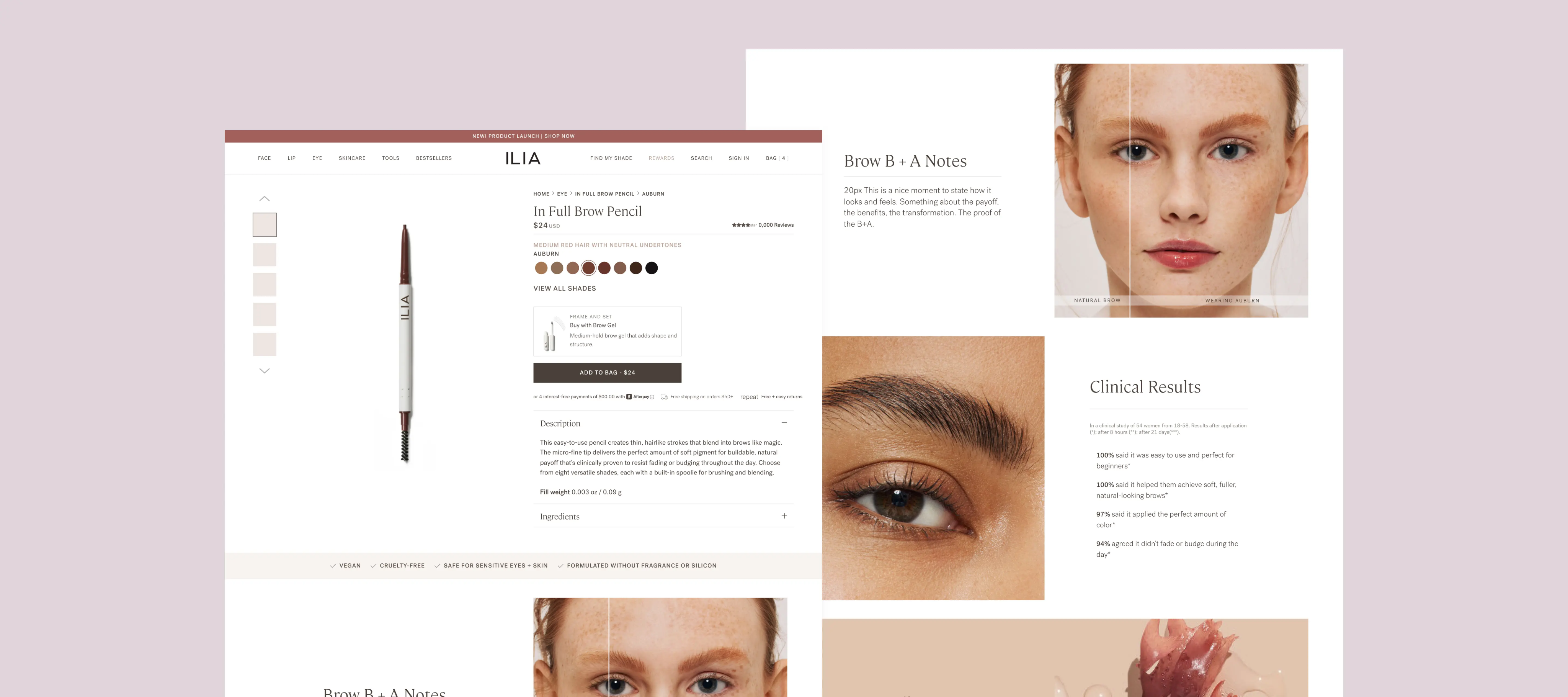
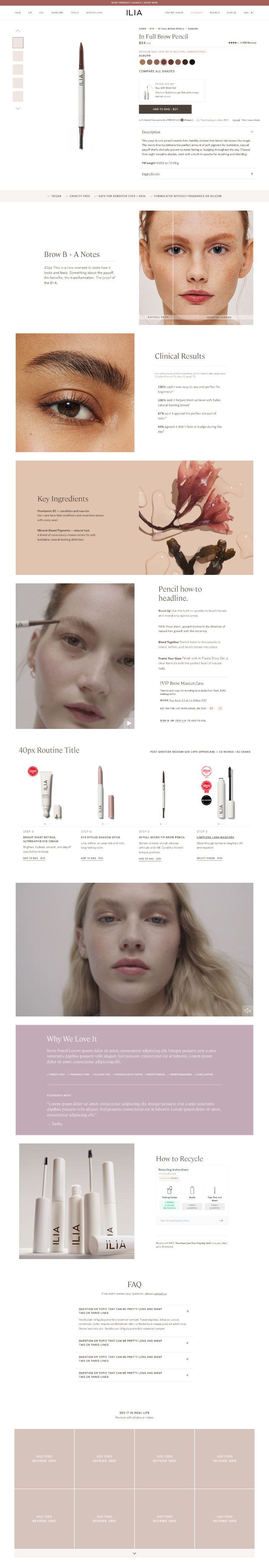
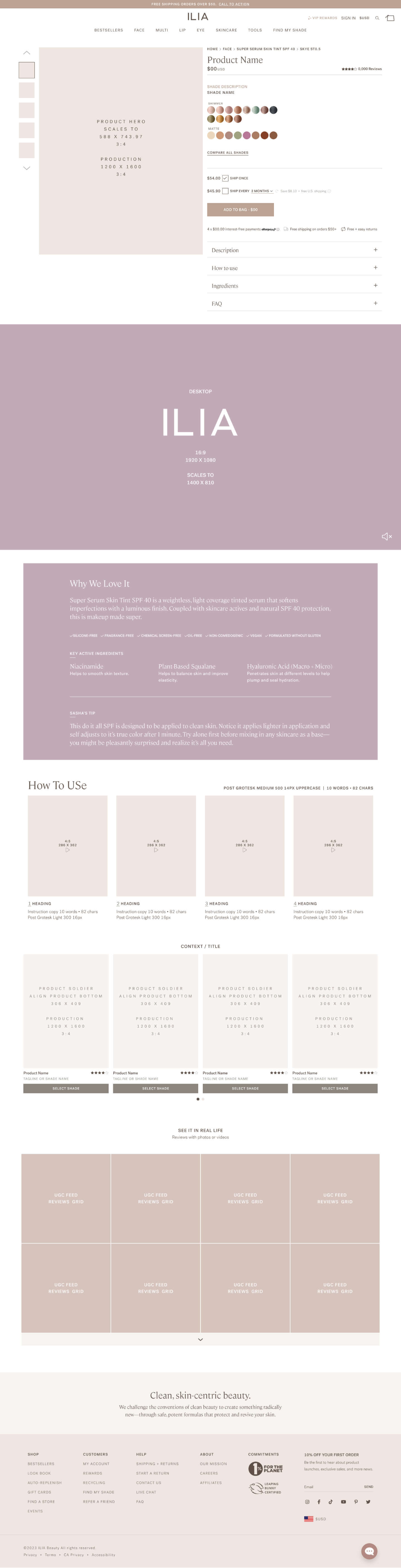
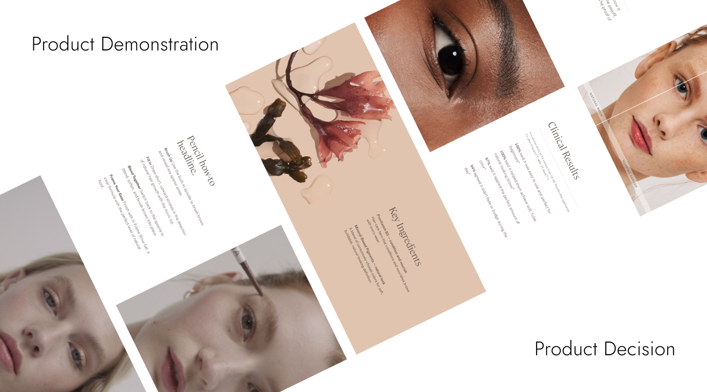
Product Demonstration vs. Product Details
New Template
Old Template
Decision Zone
Removed How To Use accordion section
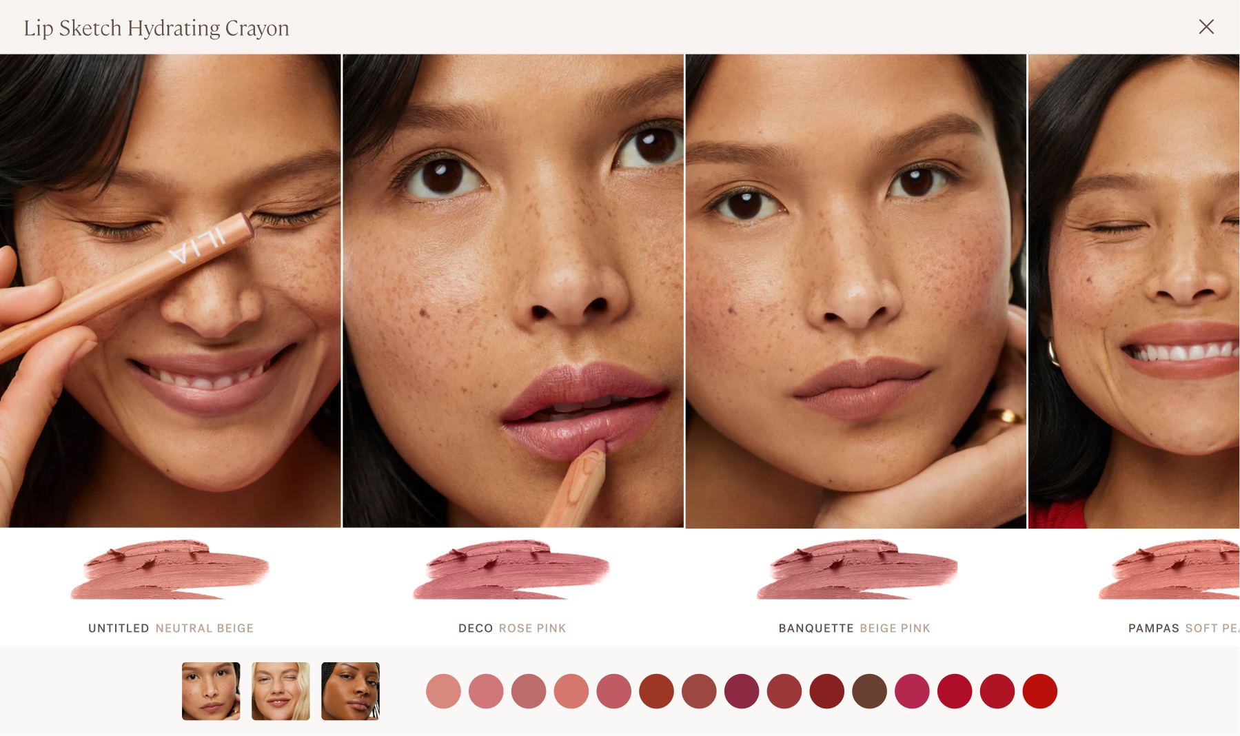
Formula Callouts
Clean-beauty assurance
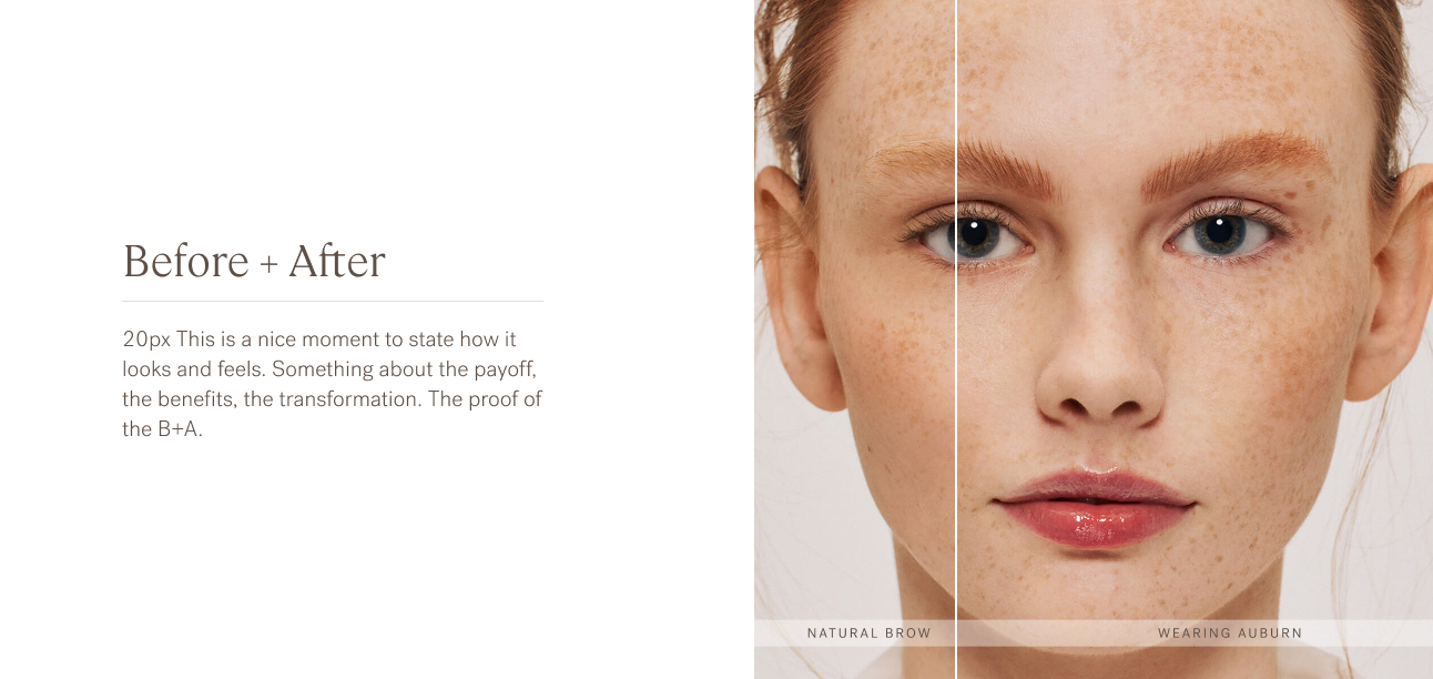
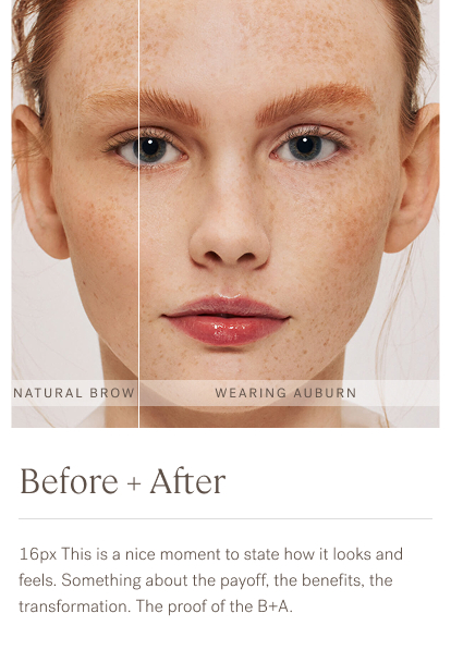
Before + After
Demonstration of the clinical claims, benefits, and transformation
Clinical Results
Proof of the product’s performance
Key Ingredients
Clean formula ingredients and their benefits.
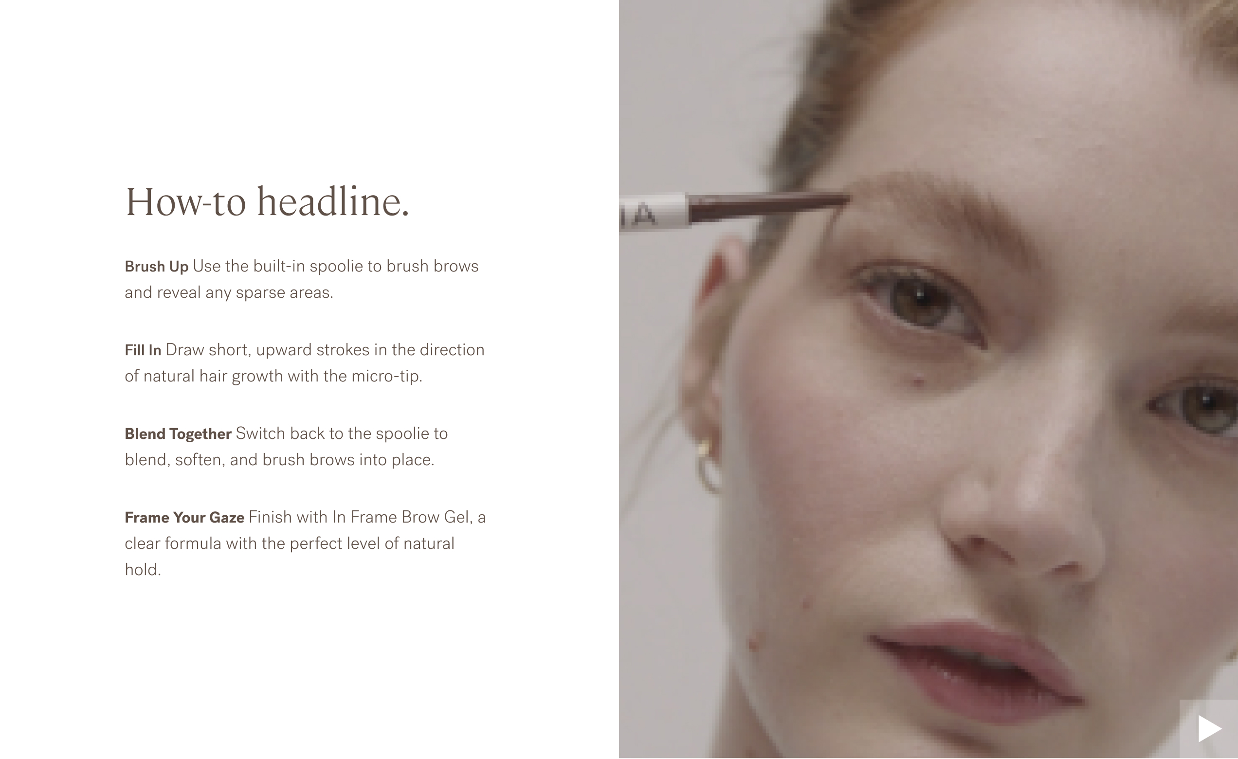
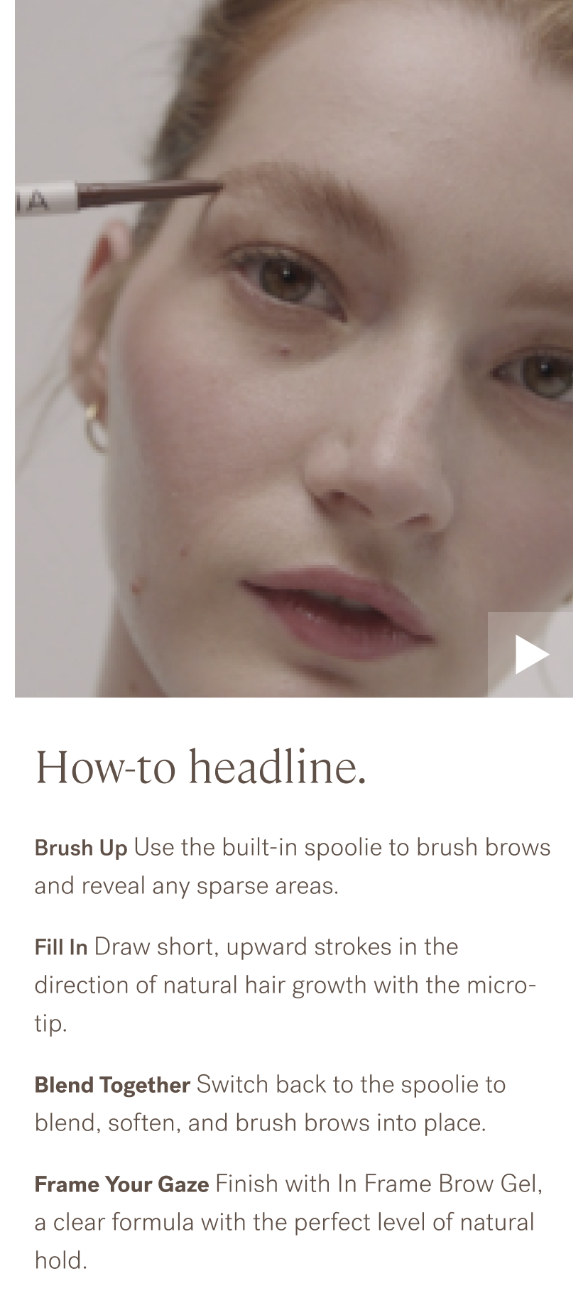
How-to Video
Quick, effortless visual demonstration with step-by-step text guide
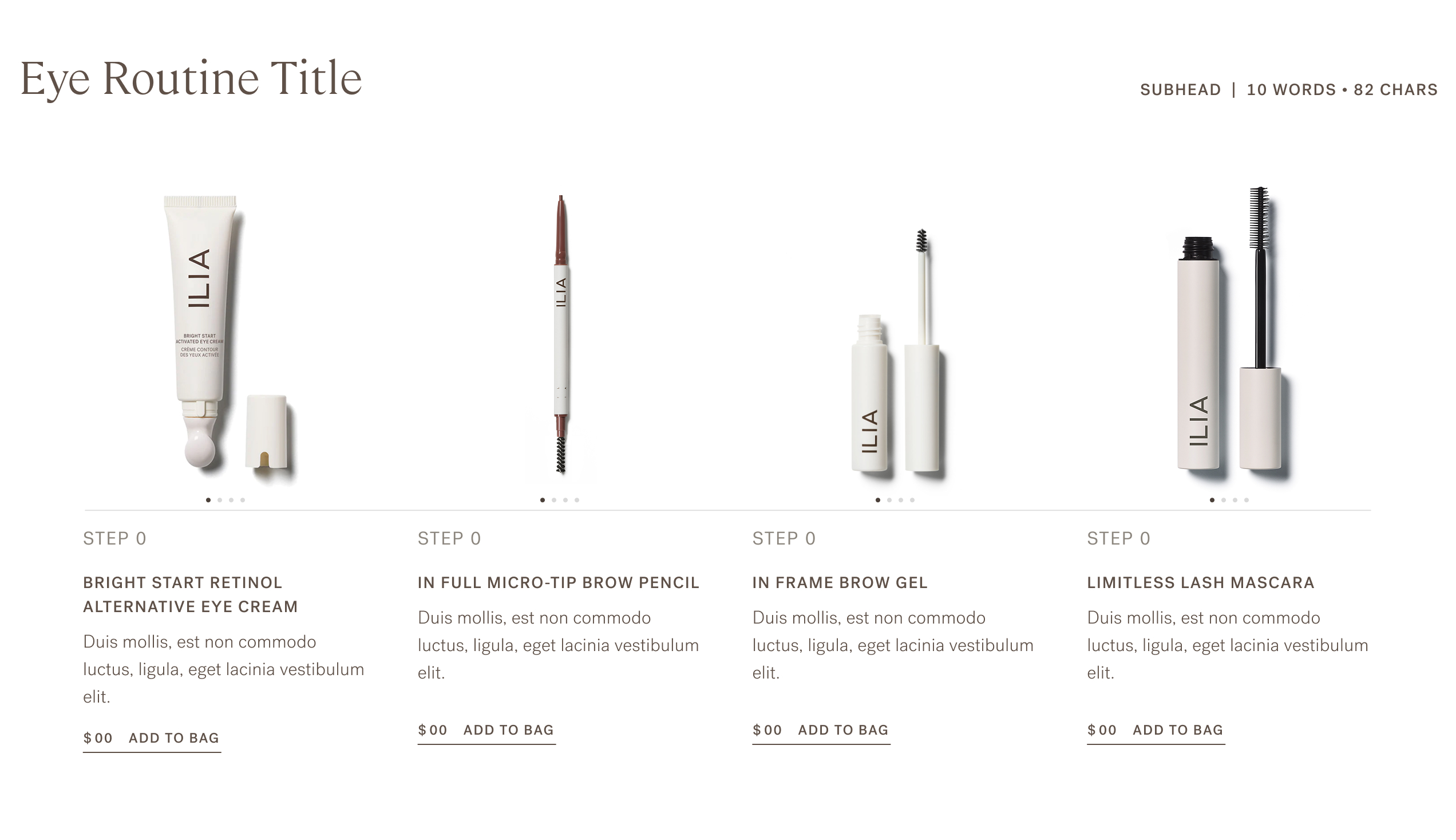
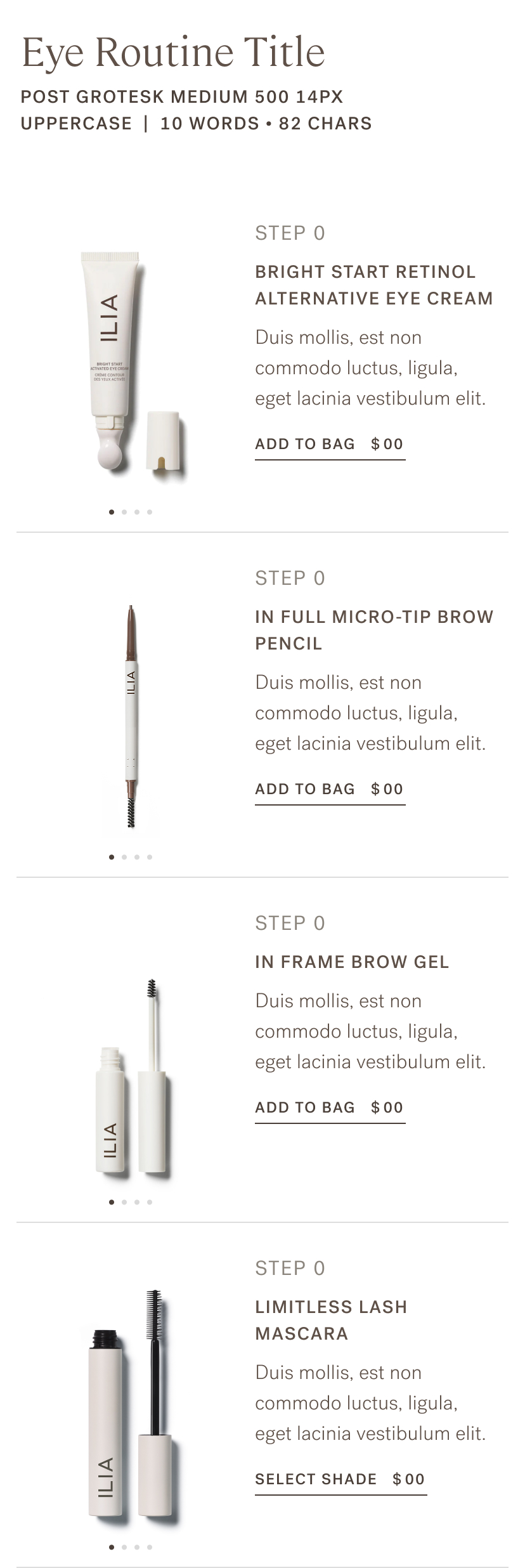
Routine Array
Cross-sell complementary products
Campaign Video
Conceptual product video
Why We Love it
Marketing sales copy and a note from the founder
Recycling
How to recycle all product components
FAQ
Product-specific questions
Customer Reviews
Masonic grid of photo reviews
Campaign Video
Product Details
hidden in accordion
Why We Love It
+ callouts + ingredients
How To Use
4 separate videos
Lots of work for the creative team and the shopper
Similar Products
Products from the same category
Reviews

Scroll

Context
The Challenge
ILIA's product detail pages weren't working hard enough. They showed products but didn't guide shoppers or build confidence in purchase decisions. The conventional layout and hierarchy presented the product as the hero and and the shopper had to make sense of all the details—struggling to understand formula benefits, visualize results, and discover complementary products.The opportunity: PDPs are where purchase decisions happen. Mimic an in-store experience and demonstrate the product. Design a hierarchy for guidance and education + clearer value proposition = higher conversion and fewer returns.
Business
Increase conversion, reduce returns, improve cross-selling, create scalable system
Shoppers
Feel what it’s like to use the product—see real results, understand formula benefits, discover complete routines, feel confident purchasing
Design Challenge
Balance product education with clean aesthetic, work across 4 product categories with one scalable template
The Impact
Conversion & Revenue
- 11% increase in PDP conversion rate
- Increased AOV through "Routine" cross-selling
- Increased scroll-depth and engagement
- Interactive before/after slider became highest-engaged PDP element
Education & Confidence
- Formula callouts (safe for sensitive eyes/skin, vegan, clean ingredients) addressed top customer questions + deal-breakers
- Before/after slider showed real results, reducing "will this work for me?" uncertainty
- Routine module surfaced complementary products contextually vs random "you might also like"
- Scalable template maintained consistency while serving diverse product needs
Operational Efficiency
- Single template system served Complexion, Color, Skincare, Sets + Bundles
- Reduced design/dev time for new product launches
- Each product type maintained unique needs within consistent framework
- UI foundation scaled over 3+ years without major redesign
The Most important touchpoint : Using the product
Instead of the product being the Hero, the shopper is the hero.
My Role + Team
My Role
As UX Strategy + Design Lead, I owned the full PDP redesign from research through implementation:
- Analyzed quantitative and qualitative data to prioritize high-impact features and easy wins
- Conducted competitive analysis across premium beauty and clean beauty brands
- Reviewed customer service inquiries revealing top questions (formula safety, shade matching, product combinations)
- Designed unified template system flexible enough to serve 4 product categories with distinct needs
- Created interactive before/after slider showcasing real customer results
- Designed mobile-first Compare Shades modal to confidently decide among many shades
- Simplified the How-To-Use feature with a single video and text instruction
- Architected "Routine" cross-selling module using contextual product recommendationsConstraint: Design one scalable template serving products as different as foundation, lipstick, serums, and gift sets while maintaining brand consistency and conversion performance.
Key Partners
Product Development Outlined formula callouts and complementary products for skincare and makeup routines.
Creative + Editorial Before + After imagery and visual standards.
Editorial Simple, friendly instructional copy for how-to-use, Routines and Before + After.
Constraint
Tactile experience Shoppers wanted to see products in action, not just product shots
Complexion is complex Complexion, skincare, and color products needed different information hierarchy
Cross-selling worked when contextual in a complete routine vs generic "customers also bought"
3 Key Design Decisions
Key Design Decisions
#1 Before+After = Purchase Confidence
The Challenge
ILIA's biggest PDP problem: shoppers couldn't visualize results. Product photography was beautiful but static. For complexion and skincare products especially, customers needed to see "will this work for me?" before committing to purchase. The old PDP showed finished looks but not the transformation.Research insight
- Customer service data showed high return rates for color and complexion products with notes like "didn't look like I expected" or "the wrong shade."
- Shoppers lacked confidence in online purchase decisions that would be easy in-store with testers.
The Solution
Designed interactive before/after slider as primary PDP feature:
- Before images showed real skin (texture, hyperpigmentation, bare face)
- After images showed product application and results
- Custom captions for each product use case
Design principleDemonstration over details. Let shoppers see the actual transformation rather than reading about payoff, coverage, or finish.
The Impact

Demonstrate the benefit
Interactive slider became highest-engaged element on PDP (tracked via Hotjar)
+9%
Trust the Transformation
CR increase in products with B+A (confident shade selection)
Be A Mirror
Qualitative feedback: "Finally could see how it would look on skin like mine"

Intentional Features
Shoppers want UGC + editorial that answers their questions and guides their decision
Key Design Decisions
#2 Video Proves It’s Easy to Use
It’s easy to use
Quick, effortless visual demonstration with step-by-step text guide
Top questions from shoppers
“What’s in it?” and “Is it easy to use?”
The Challenge
Operational: Our current feature was 4-step video vignettes that did not scale up or down (3 steps or 5 steps) and the production effort was too high to retrofit all of our product screens. Business: Beauty products are only as good as how you apply them. While product descriptions mentioned how-to-use or tips, text alone couldn't demonstrate technique. Online shopping research includes watching beauty tutorials on social and without them there is hesitation at checkout and product returns from "user error."
Research insight: During observation & inquiry, the top shopper questions where, “What’s in it?” and “Is it easy to use?”
The Solution
Simplified our 4-step video vignettes into a single video with supporting text:
Content strategy:
- Highlighted key features or benefits of the product
- Text content reinforced video key moments for those who preferred reading
- Because shoppers’ top questions were about ingredients and ease of use, we also included a still image of Ingredients and How-To-Use in the Product gallery.
Design principle: Show the technique, not just the result. Mimic the online shopping/research behavior of watching beauty tutorials
The Impact

Higher Engagement
Tutorial video kept shoppers on page longer
Anticipate Questions
Answers the common question "how do I use this?"

Up-funnel education
Created reusable content for social media, email education campaigns

Demonstrate the Details
Empowering shoppers with educational approach vs pure product selling
Key Design Decisions
#3 "Routine" Module for Contextual Cross-Selling
Curated Cross-selling as a product routine
The Challenge
ILIA wanted to increase average order value but generic "you might also like" recommendations felt random and didn't reflect how people actually use beauty products. Customers build routines—foundation + concealer + setting powder, or lip liner + lipstick + gloss—but the old PDP didn't guide these natural product combinations.Research insight: Shoppers often talked about their “routine” or products that work “better together” but shoppers were left to figure it out themselves.
The Solution
Designed "Routine" module showing complete product sets curated for the item being viewed:
- Product array showing items that complement the current product
- Each item includes key PDP gallery assets: product, shades on skin tones, ingredients, how-to-use, price
- Enough information to make purchase decision without leaving page
- Handles inventory/waitlist for out-of-stock items
Design principle:Shop like you'd use it. Show products in the context of how they work together, making the shopping experience feel helpful rather than pushy.
The Impact

Basket Builder
AOV increase—by presenting relevant products in context

Bundled Solution
Higher customer satisfaction with complete solutions, not piecemeal recommendations

Reduced Cognitive Load
Reduced "what goes with this?" uncertainty or hesitation


Custom Routine
Created foundation for future personalization (routines based on skin type, preferences)
What I Learned
This project taught me that the best conversion optimization comes from removing uncertainty, not adding sales tactics. When shoppers feel confident in their decision, they buy confidently—and they don't return items.
Key Insights
Education drives conversion The before/after slider, formula callouts, and routine recommendations all served the same goal: help shoppers make informed decisions. Counter-intuitively, more information (when presented clearly) reduced friction rather than adding it.
One template, four categories requires systems thinking Designing a single template flexible enough to serve foundation, lipstick, serum, and gift sets meant identifying what was universal vs category-specific. The core structure stayed consistent (images, specs, callouts, routine), but content hierarchy adapted to product type.
Cross-selling works when contextual Generic "you might also like" recommendations don't convert. But showing "here's the complete routine" with curated, logical product combinations feels helpful, not pushy. Context matters.
Roadmap
Future Iterations
Bring in more personalization and UGC peer proof
This PDP foundation supports future enhancements we designed for but didn't build in V1:
- Personalized messaging routines based on skin type, concerns, shade
- Highlight and elevate before/after submissions from product reviews
Featured Projects
Ilia Beauty
Remove The Barrier
Ilia Beauty
Compare Shades
American Association of Cardiac-Care Nurses
The Whole Nurse Platform
Align Technology
Unified Global CRM
Ilia Beauty
Show & Sell
Ilia Beauty
Let’s Get Personal
Coming
Soon
Andrea Fratto
Resume
ILIA Beauty
Demo the Details
Shopper-centric templates elevating education and conversion across product lines
Role
UX Strategy + Design Lead
Timeline
2022 • 1 months
Platform
Shopify Plus
Impact
11% increase in conversion
Increased AOV with Routine cross-sell
Increased scroll depth + engagement
Operational efficiency
Product Demonstration vs. Product Details
New Template
Old Template
Decision Zone
Removed How To Use accordion section
Formula Callouts
Clean-beauty assurance
Before + After
Demonstration of the clinical claims, benefits, and transformation
Clinical Results
Proof of the product’s performance
Key Ingredients
Clean formula ingredients and their benefits.
How-to Video
Quick, effortless visual demonstration with step-by-step text guide
Routine Array
Cross-sell complementary products
Campaign Video
Conceptual product video
Why We Love it
Marketing sales copy and a note from the founder
Recycling
How to recycle all product components
FAQ
Product-specific questions
Customer Reviews
Masonic grid of photo reviews
Campaign Video
Product Details
hidden in accordion
Why We Love It
+ callouts + ingredients
How To Use
4 separate videos
Lots of work for the creative team and the shopper
Similar Products
Products from the same category
Reviews

Scroll

The Challenge
The Impact
ILIA's product detail pages weren't working hard enough. They showed products but didn't guide shoppers or build confidence in purchase decisions. The conventional layout and hierarchy presented the product as the hero and and the shopper had to make sense of all the details—struggling to understand formula benefits, visualize results, and discover complementary products.The opportunity: PDPs are where purchase decisions happen. Mimic an in-store experience and demonstrate the product. Design a hierarchy for guidance and education + clearer value proposition = higher conversion and fewer returns.
Business
Increase conversion, reduce returns, improve cross-selling, create scalable system
Shoppers
Feel what it’s like to use the product—see real results, understand formula benefits, discover complete routines, feel confident purchasing
Design Challenge
Balance product education with clean aesthetic, work across 4 product categories with one scalable template
Conversion & Revenue
- 11% increase in PDP conversion rate
- Increased AOV through "Routine" cross-selling
- Increased scroll-depth and engagement
- Interactive before/after slider became highest-engaged PDP element
Education & Confidence
- Formula callouts (safe for sensitive eyes/skin, vegan, clean ingredients) addressed top customer questions + deal-breakers
- Before/after slider showed real results, reducing "will this work for me?" uncertainty
- Routine module surfaced complementary products contextually vs random "you might also like"
- Scalable template maintained consistency while serving diverse product needs
Operational Efficiency
- Single template system served Complexion, Color, Skincare, Sets + Bundles
- Reduced design/dev time for new product launches
- Each product type maintained unique needs within consistent framework
- UI foundation scaled over 3+ years without major redesign
The Most important touchpoint : Using the product
Instead of the product being the Hero, the shopper is the hero.
My Role + Team
My Role
As UX Strategy + Design Lead, I owned the full PDP redesign from research through implementation:
- Analyzed quantitative and qualitative data to prioritize high-impact features and easy wins
- Conducted competitive analysis across premium beauty and clean beauty brands
- Reviewed customer service inquiries revealing top questions (formula safety, shade matching, product combinations)
- Designed unified template system flexible enough to serve 4 product categories with distinct needs
- Created interactive before/after slider showcasing real customer results
- Designed mobile-first Compare Shades modal to confidently decide among many shades
- Simplified the How-To-Use feature with a single video and text instruction
- Architected "Routine" cross-selling module using contextual product recommendationsConstraint: Design one scalable template serving products as different as foundation, lipstick, serums, and gift sets while maintaining brand consistency and conversion performance.
Key Partners
Product Development Outlined formula callouts and complementary products for skincare and makeup routines.
Creative + Editorial Before + After imagery and visual standards.
Editorial Simple, friendly instructional copy for how-to-use, Routines and Before + After.
Constraint
Tactile experience Shoppers wanted to see products in action, not just product shots
Complexion is complex Complexion, skincare, and color products needed different information hierarchy
Cross-selling worked when contextual in a complete routine vs generic "customers also bought"
3 Key Design Decisions
Key Design Decisions
#1 Before+After = Purchase Confidence
The Challenge
ILIA's biggest PDP problem: shoppers couldn't visualize results. Product photography was beautiful but static. For complexion and skincare products especially, customers needed to see "will this work for me?" before committing to purchase. The old PDP showed finished looks but not the transformation.Research insight
- Customer service data showed high return rates for color and complexion products with notes like "didn't look like I expected" or "the wrong shade."
- Shoppers lacked confidence in online purchase decisions that would be easy in-store with testers.
The Solution
Designed interactive before/after slider as primary PDP feature:
- Before images showed real skin (texture, hyperpigmentation, bare face)
- After images showed product application and results
- Custom captions for each product use case
Design principleDemonstration over details. Let shoppers see the actual transformation rather than reading about payoff, coverage, or finish.
The Impact
Demonstrate the benefit
Interactive slider became highest-engaged element on PDP (tracked via Hotjar)
+9%
Trust the Transformation
CR increase in products with B+A (confident shade selection)
Be A Mirror
Qualitative feedback: "Finally could see how it would look on skin like mine"
Intentional Features
Shoppers want UGC + editorial that answers their questions and guides their decision
Key Design Decisions
#2 Video Proves It’s Easy to Use
It’s easy to use
Quick, effortless visual demonstration with step-by-step text guide
Top questions from shoppers
“What’s in it?” and “Is it easy to use?”
The Challenge
Operational: Our current feature was 4-step video vignettes that did not scale up or down (3 steps or 5 steps) and the production effort was too high to retrofit all of our product screens. Business: Beauty products are only as good as how you apply them. While product descriptions mentioned how-to-use or tips, text alone couldn't demonstrate technique. Online shopping research includes watching beauty tutorials on social and without them there is hesitation at checkout and product returns from "user error."
Research insight: During observation & inquiry, the top shopper questions where, “What’s in it?” and “Is it easy to use?”
The Solution
Simplified our 4-step video vignettes into a single video with supporting text:
Content strategy:
- Highlighted key features or benefits of the product
- Text content reinforced video key moments for those who preferred reading
- Because shoppers’ top questions were about ingredients and ease of use, we also included a still image of Ingredients and How-To-Use in the Product gallery.
Design principle: Show the technique, not just the result. Mimic the online shopping/research behavior of watching beauty tutorials
The Impact
Higher Engagement
Tutorial video kept shoppers on page longer
Anticipate Questions
Answers the common question "how do I use this?"
Up-funnel education
Created reusable content for social media, email education campaigns
Demonstrate the details
Empowering shoppers with educational approach vs pure product selling
Key Design Decisions
#3 "Routine" Module for Contextual Cross-Selling
Curated Cross-selling as a Product routine
The Challenge
ILIA wanted to increase average order value but generic "you might also like" recommendations felt random and didn't reflect how people actually use beauty products. Customers build routines—foundation + concealer + setting powder, or lip liner + lipstick + gloss—but the old PDP didn't guide these natural product combinations.Research insight: Shoppers often talked about their “routine” or products that work “better together” but shoppers were left to figure it out themselves.
The Solution
Designed "Routine" module showing complete product sets curated for the item being viewed:
- Product array showing items that complement the current product
- Each item includes key PDP gallery assets: product, shades on skin tones, ingredients, how-to-use, price
- Enough information to make purchase decision without leaving page
- Handles inventory/waitlist for out-of-stock items
Design principle:Shop like you'd use it. Show products in the context of how they work together, making the shopping experience feel helpful rather than pushy.
The Impact
Basket Builder
AOV increase—by presenting relevant products in context
Bundled Solution
Higher customer satisfaction with complete solutions, not piecemeal recommendations
Reduced Cognitive Load
Reduced "what goes with this?" uncertainty or hesitation
Custom Routine
Created foundation for future personalization (routines based on skin type, preferences)
What I Learned
This project taught me that the best conversion optimization comes from removing uncertainty, not adding sales tactics. When shoppers feel confident in their decision, they buy confidently—and they don't return items.
Key Insights
Education drives conversion The before/after slider, formula callouts, and routine recommendations all served the same goal: help shoppers make informed decisions. Counter-intuitively, more information (when presented clearly) reduced friction rather than adding it.
Cross-selling works when contextual Generic "you might also like" recommendations don't convert. But showing "here's the complete routine" with curated, logical product combinations feels helpful, not pushy. Context matters.
One template, four categories requires systems thinking Designing a single template flexible enough to serve foundation, lipstick, serum, and gift sets meant identifying what was universal vs category-specific. The core structure stayed consistent (images, specs, callouts, routine), but content hierarchy adapted to product type.
Roadmap
Future Iterations
Bring in more personalization and UGC peer proof
This PDP foundation supports future enhancements we designed for but didn't build in V1:
- Personalized messaging routines based on skin type, concerns, shade
- Highlight and elevate before/after submissions from product reviews
Featured Projects
Ilia Beauty
Remove The Barrier
Ilia Beauty
Compare Shades
American Association of Cardiac-Care Nurses
The Whole Nurse Platform
Align Technology
Unified Global CRM
Ilia Beauty
Show & Sell
Ilia Beauty
Let’s Get Personal
Coming
Soon
ILIA Beauty
Demo the Details
Shopper-centric templates elevating education and conversion across product lines
Role
UX Strategy + Design Lead
Timeline
2022 • 1 months
Platform
Shopify Plus
Impact
11% increase in conversion
Increased AOV with Routine cross-sell
Increased scroll depth + engagement
Operational efficiency
Product Demonstration vs. Product Details
New Template
Old Template
Decision Zone
Removed How To Use accordion section
Formula Callouts
Clean-beauty assurance
Before + After
Demonstration of the clinical claims, benefits, and transformation
Clinical Results
Proof of the product’s performance
Key Ingredients
Clean formula ingredients and their benefits.
How-to Video
Quick, effortless visual demonstration with step-by-step text guide
Routine Array
Cross-sell complementary products
Campaign Video
Conceptual product video
Why We Love it
Marketing sales copy and a note from the founder
Recycling
How to recycle all product components
FAQ
Product-specific questions
Customer Reviews
Masonic grid of photo reviews
Campaign Video
Product Details
hidden in accordion
Why We Love It
+ callouts + ingredients
How To Use
4 separate videos
Lots of work for the creative team and the shopper
Similar Products
Products from the same category
Reviews

Scroll

The Challenge
The Impact
ILIA's product detail pages weren't working hard enough. They showed products but didn't guide shoppers or build confidence in purchase decisions. The conventional layout and hierarchy presented the product as the hero and and the shopper had to make sense of all the details—struggling to understand formula benefits, visualize results, and discover complementary products.The opportunity: PDPs are where purchase decisions happen. Mimic an in-store experience and demonstrate the product. Design a hierarchy for guidance and education + clearer value proposition = higher conversion and fewer returns.
Business
Increase conversion, reduce returns, improve cross-selling, create scalable system
Shoppers
Feel what it’s like to use the product—see real results, understand formula benefits, discover complete routines, feel confident purchasing
Design Challenge
Balance product education with clean aesthetic, work across 4 product categories with one scalable template
Conversion & Revenue
- 11% increase in PDP conversion rate
- Increased AOV through "Routine" cross-selling
- Increased scroll-depth and engagement
- Interactive before/after slider became highest-engaged PDP element
Education & Confidence
- Formula callouts (safe for sensitive eyes/skin, vegan, clean ingredients) addressed top customer questions + deal-breakers
- Before/after slider showed real results, reducing "will this work for me?" uncertainty
- Routine module surfaced complementary products contextually vs random "you might also like"
- Scalable template maintained consistency while serving diverse product needs
Operational Efficiency
- Single template system served Complexion, Color, Skincare, Sets + Bundles
- Reduced design/dev time for new product launches
- Each product type maintained unique needs within consistent framework
- UI foundation scaled over 3+ years without major redesign
The Most important touchpoint : Using the product
Instead of the product being the Hero, the shopper is the hero.
My Role + Team
My Role
As UX Strategy + Design Lead, I owned the full PDP redesign from research through implementation:
- Analyzed quantitative and qualitative data to prioritize high-impact features and easy wins
- Conducted competitive analysis across premium beauty and clean beauty brands
- Reviewed customer service inquiries revealing top questions (formula safety, shade matching, product combinations)
- Designed unified template system flexible enough to serve 4 product categories with distinct needs
- Created interactive before/after slider showcasing real customer results
- Designed mobile-first Compare Shades modal to confidently decide among many shades
- Simplified the How-To-Use feature with a single video and text instruction
- Architected "Routine" cross-selling module using contextual product recommendationsConstraint: Design one scalable template serving products as different as foundation, lipstick, serums, and gift sets while maintaining brand consistency and conversion performance.
Key Partners
Product Development Outlined formula callouts and complementary products for skincare and makeup routines.
Creative + Editorial Before + After imagery and visual standards.
Editorial Simple, friendly instructional copy for how-to-use, Routines and Before + After.
Constraint
Tactile experience Shoppers wanted to see products in action, not just product shots
Complexion is complex Complexion, skincare, and color products needed different information hierarchy
Cross-selling worked when contextual in a complete routine vs generic "customers also bought"
3 Key Design Decisions
Key Design Decisions
#1 Before+After = Purchase Confidence
The Challenge
ILIA's biggest PDP problem: shoppers couldn't visualize results. Product photography was beautiful but static. For complexion and skincare products especially, customers needed to see "will this work for me?" before committing to purchase. The old PDP showed finished looks but not the transformation.Research insight
- Customer service data showed high return rates for color and complexion products with notes like "didn't look like I expected" or "the wrong shade."
- Shoppers lacked confidence in online purchase decisions that would be easy in-store with testers.
The Solution
Designed interactive before/after slider as primary PDP feature:
- Before images showed real skin (texture, hyperpigmentation, bare face)
- After images showed product application and results
- Custom captions for each product use case
Design principleDemonstration over details. Let shoppers see the actual transformation rather than reading about payoff, coverage, or finish.
The Impact
Demonstrate the benefit
Interactive slider became highest-engaged element on PDP (tracked via Hotjar)
+11%
Trust the Transformation
CR increase in products with B+A (confident shade selection)
Be A Mirror
Qualitative feedback: "Finally could see how it would look on skin like mine"
Intentional Features
Shoppers want UGC + editorial that answers their questions and guides their decision
Key Design Decisions
#2 Video Proves It’s Easy to Use
It’s easy to use
Quick, effortless visual demonstration with step-by-step text guide
Top questions from shoppers
“What’s in it?” and “Is it easy to use?”
The Challenge
Operational: Our current feature was 4-step video vignettes that did not scale up or down (3 steps or 5 steps) and the production effort was too high to retrofit all of our product screens. Business: Beauty products are only as good as how you apply them. While product descriptions mentioned how-to-use or tips, text alone couldn't demonstrate technique. Online shopping research includes watching beauty tutorials on social and without them there is hesitation at checkout and product returns from "user error."
Research insight: During observation & inquiry, the top shopper questions where, “What’s in it?” and “Is it easy to use?”
The Solution
Simplified our 4-step video vignettes into a single video with supporting text:
Content strategy:
- Highlighted key features or benefits of the product
- Text content reinforced video key moments for those who preferred reading
- Because shoppers’ top questions were about ingredients and ease of use, we also included a still image of Ingredients and How-To-Use in the Product gallery.
Design principle: Show the technique, not just the result. Mimic the online shopping/research behavior of watching beauty tutorials
The Impact
Higher Engagement
Tutorial video kept shoppers on page longer
Anticipate Questions
Answers the common question "how do I use this?"
Up-funnel education
Created reusable content for social media, email education campaigns
Demonstrate the details
Empowering shoppers with educational approach vs pure product selling
Key Design Decisions
#3 "Routine" Module for Contextual Cross-Selling
Curated Cross-selling as a Product routine
The Challenge
ILIA wanted to increase average order value but generic "you might also like" recommendations felt random and didn't reflect how people actually use beauty products. Customers build routines—foundation + concealer + setting powder, or lip liner + lipstick + gloss—but the old PDP didn't guide these natural product combinations.Research insight: Shoppers often talked about their “routine” or products that work “better together” but they were left to figure it out themselves.
The Solution
Designed "Routine" module showing complete product sets curated for the item being viewed:
- Product array showing items that complement the current product
- Each item includes key PDP gallery assets: product, shades on skin tones, ingredients, how-to-use, price
- Enough information to make purchase decision without leaving page
- Handles inventory/waitlist for out-of-stock items
Design principle:Shop like you'd use it. Show products in the context of how they work together, making the shopping experience feel helpful rather than pushy.
The Impact
Basket Builder
AOV increase—by presenting relevant products in context
Bundled Solution
Higher customer satisfaction with complete solutions, not piecemeal recommendations
Reduced Cognitive Load
Reduced "what goes with this?" uncertainty or hesitation
Custom Routine
Created foundation for future personalization (routines based on skin type, preferences)
What I Learned
This project taught me that the best conversion optimization comes from removing uncertainty, not adding sales tactics. When shoppers feel confident in their decision, they buy confidently—and they don't return items.
Key Insights
Education drives conversion The before/after slider, formula callouts, and routine recommendations all served the same goal: help shoppers make informed decisions. Counter-intuitively, more information (when presented clearly) reduced friction rather than adding it.
One template, four categories requires systems thinking Designing a single template flexible enough to serve foundation, lipstick, serum, and gift sets meant identifying what was universal vs category-specific. The core structure stayed consistent (images, specs, callouts, routine), but content hierarchy adapted to product type.
Cross-selling works when contextual Generic "you might also like" recommendations don't convert. But showing "here's the complete routine" with curated, logical product combinations feels helpful, not pushy. Context matters.
Roadmap
Future Iterations
Bring in more personalization and UGC peer proof
This PDP foundation supports future enhancements we designed for but didn't build in V1:
- Personalized messaging routines based on skin type, concerns, shade
- Highlight and elevate before/after submissions from product reviews
Featured Projects
Ilia Beauty
Remove The Barrier
Ilia Beauty
Compare Shades
American Association of Cardiac-Care Nurses
The Whole Nurse Platform
Align Technology
Unified Global CRM
Ilia Beauty
Show & Sell
Ilia Beauty
Let’s Get Personal
Coming
Soon